Product page layout and blocks
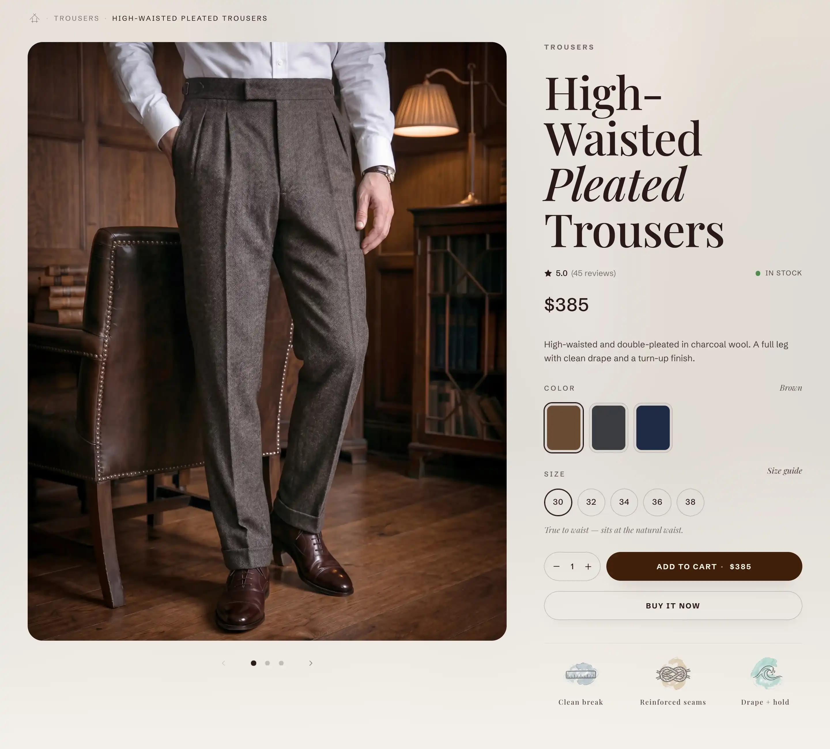
Product information is the main section of every product page. It places the media gallery on one side and a details column on the other, and you fill the details column with blocks like the title, price, and description. On a product template it is already in place. You can also add it to another page as Featured product to show one chosen product.
Open or add the section
On a product template the Product information section is already there. To open it:
- In the Shopify admin, go to Online Store > Themes and click Customize on Reign.
- Switch the page dropdown at the top to a product.
- In the sidebar, click Product information to open its settings.
To feature a product on another page, click Add section, open the Products group, and choose Featured product. It is added as a Product information section. Then set its Product to the product you want.
How the section is built
The section holds two regions, listed under it in the block list:
- Product media gallery: the product's images and videos. It has its own article: see Product media gallery and lightbox.
- Product info: the details column, a stack of smaller blocks (title, price, description, and more). See The info column below.
To change what shows in the details column, expand Product info in the sidebar. Add a block with Add block, drag a block to reorder it, or select one and remove it.
Section settings
These settings sit on the Product information section itself.
Product
- Product: the product to show. Leave it empty on a product template, where the page supplies its own product. Set it when you use the section as Featured product on another page.
Ambient background
A soft blurred wash behind the page, taken from the product's first image.
- Show ambient background: turns the wash on.
- Ambient opacity: how strong the wash is, from 1 to 50 percent. Shows when Show ambient background is on.
Layout
- Media position: which side the gallery sits on, Left or Right. The details column takes the other side.
- Media width: how much of the row the gallery takes, from 30 to 80 percent. The details column fills the rest.
- Sticky media & details: on desktop, keeps the shorter column in view while the taller one scrolls. On phones both columns stack.
This section also uses the standard Color, Padding, and Margin controls. See Common section settings.
The info column
The details column is the Product info region. It stacks the blocks you add, in the order set in the block list. Each block is tied to the page's product, so you do not pick a product on the block itself.
- Gap between blocks: the vertical space between the stacked blocks, from 8 to 64 pixels.
A starting product page stacks the title, price, description, variant picker, and buy buttons. Reorder them, remove what you do not need, and add more with Add block under Product info. The blocks below have their own settings. Other product blocks have their own articles: Variant pickers and swatches, Buy buttons and sticky add to cart, and Collapsible rows.
Product title
The product's name, pulled from the product.
- Heading level: the heading tag, H1, H2, or H3. Keep the main product page on H1 for search engines. Use H2 or H3 when the section is a secondary feature on another page.
- Italicize second word: sets the second word of the title in italic for a styled look.
This block also uses the standard Margin controls. See Common section settings.
Price
The selected variant's price, with the compare-at price and a sale style when the product is on sale.
- Show compare-at price on sale: shows the original price struck through next to the sale price.
- Show installments: shows pay-over-time offers (Shop Pay, Affirm, Klarna) under the price.
- Show tax information: adds a tax note and, when you have one, a link to your shipping policy.
This block also uses the standard Margin controls. See Common section settings.
Product description
The product's description, pulled from the product. You edit the text on the product in the admin, not in the theme editor. It has no settings of its own and uses the standard Margin controls. See Common section settings.
Share
An optional block with a share button for the product. Add it under Product info with Add block.
- Button label: the text on the button (default Share).
- Share method: how shoppers share the product.
- Share buttons: opens a small popover of social buttons (the ones you turn on below) and a copy-link button.
- Device share sheet: opens the device's own share sheet, so the shopper can send the link to any app they have. It shows on supported devices (mostly mobile). On desktop it falls back to the share buttons.
- Both: the device share sheet where it is supported, with the share buttons as the fallback.
- Show Facebook, Show X (Twitter), Show Pinterest, Show WhatsApp, Show copy link: pick which buttons appear in the popover.
This block also uses the standard Margin controls. See Common section settings.
Tips
- Media width and Media position work together. Set the gallery side first, then the split, and check both on a phone where the columns stack.
- Use Sticky media & details so the shorter column follows the shopper down a long product page. It applies on desktop only.
- A section setting applies to every product on the same template, not to one product. If a change does not show on a product, confirm you are editing the template that product uses.
- On the Share block, Both reaches the most shoppers: the familiar device share sheet on phones, the share buttons on desktop.