Variant pickers and swatches
Reign shows variant options in two places. The Variant picker block lets a shopper choose options (size, color, material) on the product page. The Swatches block shows color choices on product cards in listings. This article covers both. For how blocks fit inside a section, see Sections, blocks, and groups.
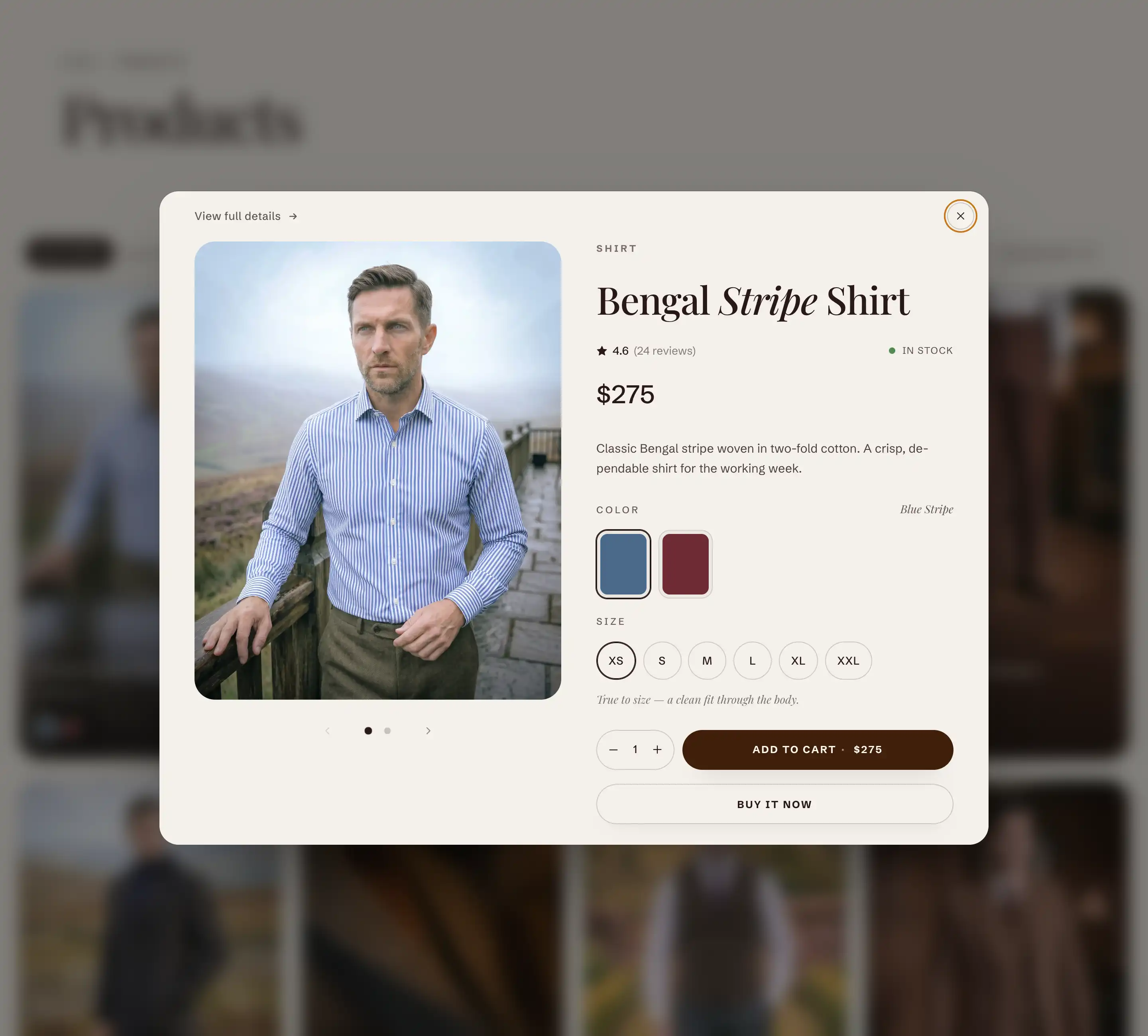
Variant picker (product page)
The Variant picker block adds the option selector inside the product details on a product page. It reads its options from the product it sits in, so you do not pick a product for it. The block is added from Add block under the Products group.
Add the block
- Open the theme editor and go to a product page template.
- Select the Product information section.
- Click Add block, then choose Variant picker from the Products group.
- Drag the block to where you want the option selector to appear in the section's blocks.
Settings
- Style: how options render. Pills shows each value as a tappable button. Dropdowns shows each option as a select menu. This applies to every option that is not shown as a swatch.
- Use image swatches: when an option carries swatch images set in your Shopify admin, that option renders as visual swatches instead of pills or a dropdown. Turn it off to keep every option as plain pills or dropdowns. When it is on, a swatch option stays a swatch even if Style is set to Pills or Dropdowns.
- Variant option name: the name of the option that gets the note below it, and where a pop-up trigger appears (a size guide, for example). Type the exact option name as it exists on the product, such as Size.
- Variant option note: short text shown under the option named above. Use it for guidance like fit or care. Italic and bold are supported.
Add a pop-up link (size guide)
The Variant picker block accepts an Inline pop-up child block. Its trigger renders next to the option you named in Variant option name. To use it, add the Inline pop-up block inside the Variant picker block, then set Variant option name to the option you want it tied to.
This block also uses the standard Margin controls. See Common section settings.
Swatches (product cards)
The Swatches block adds color swatches to a product card in listings, so a shopper can preview colors without opening the product. It belongs to the product card and uses the card's own product, so there is no product to pick. It shows the first product option that carries native Shopify swatches, and only when that option has more than one value.
Find the block
The Swatches block lives inside the product card. To reach its settings, open a section that shows product cards (a collection or a featured product grid, for example), open the card's blocks, and select Swatches.
Display
- Show variant image: shows the variant photo on each swatch instead of the swatch color or pattern.
- Swap card image on swatch hover: when on, hovering a swatch swaps the card's main image to that variant's image.
This block also uses the standard Margin controls. See Common section settings.
Tips
- Use image swatches and the Swatches block both rely on swatches you set up in Shopify admin, on the product option values. If swatches do not appear, confirm the option has color or image swatches assigned there first.
- The Swatches block only renders when the product has an option with swatches and that option has more than one value. A product with a single color will not show a swatch row.
- For the Variant option note and the pop-up link to attach, Variant option name must match the product's option name exactly.