The default template for your collection pages (collection.json) consists of two main sections: the Collection banner, which acts as the header, and the Product grid, which displays the list of products.
Collection Banner
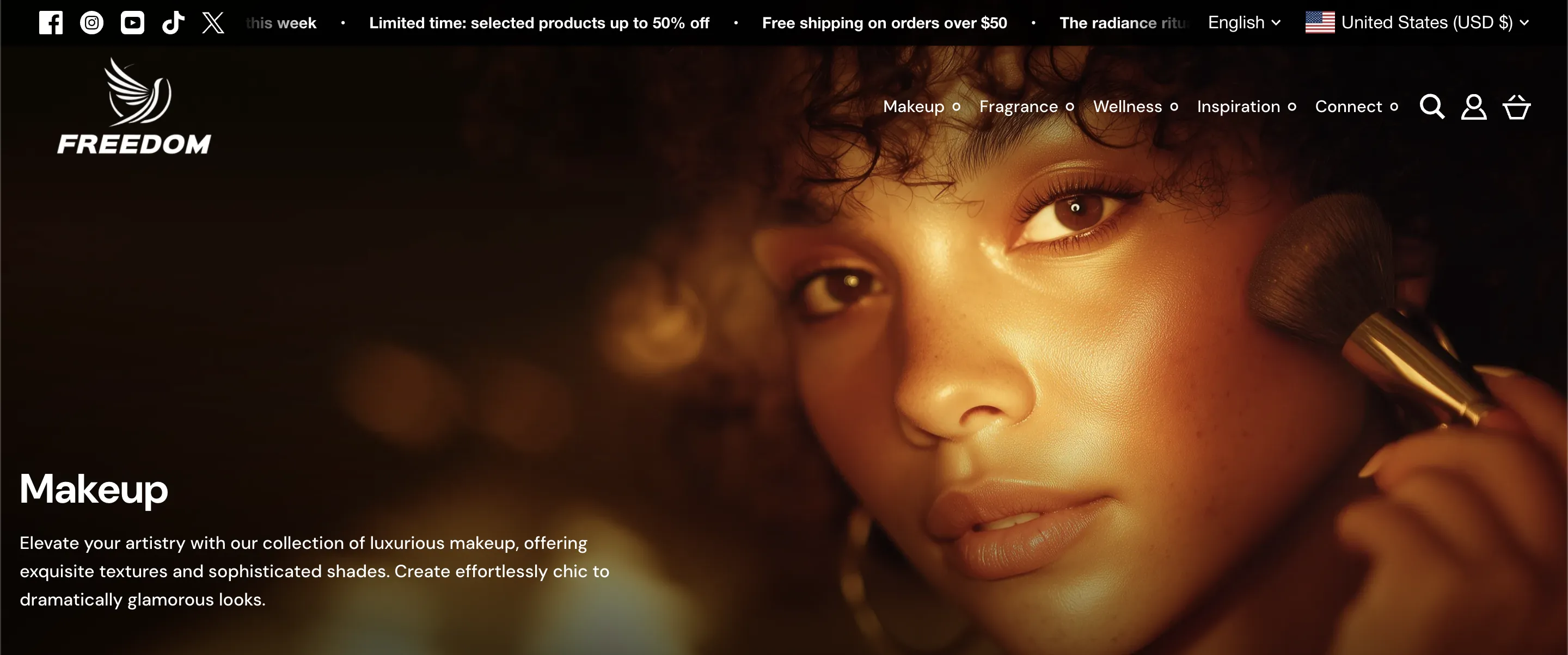
This section displays the core identity of your collection.
Important: The content displayed here (Title, Description, and Collection Image) is managed in your Shopify Admin > Products > Collections. You should not edit the collection title or image directly in the Theme Editor.
Appearance & Layout Settings
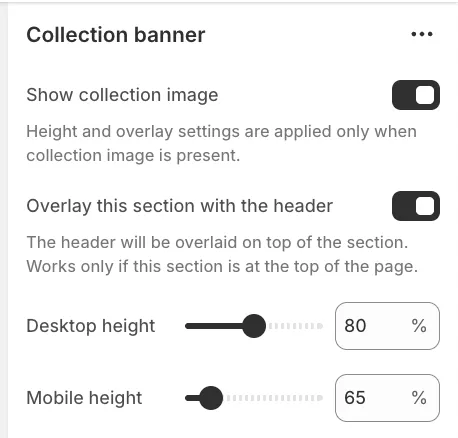
Show collection image
Unchecking this setting will hide the collection's featured image, displaying only the title and description on a solid background.
Overlay this section with the header
When enabled, the site header (logo and menu) will sit on top of the banner image rather than above it. This creates a seamless, immersive "hero" effect.
Height
You can independently adjust the Desktop height and Mobile height (in percentages) to control how much vertical space the banner occupies.
Layout
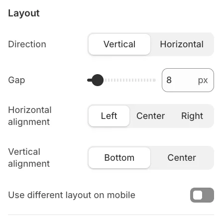
These controls determine where the text content sits within the banner. You can adjust the Horizontal alignment (Left, Center, Right) and Vertical alignment (Bottom, Center).
Background overlay
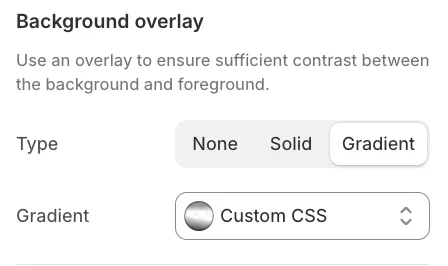
To ensure text remains readable against busy background images, you can apply a Solid or Gradient overlay. You can customize the gradient style directly in the settings.
Animation
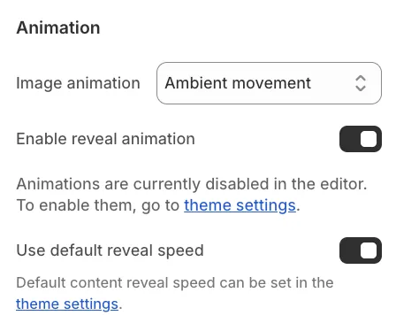
In addition to the standard content reveal animation, you can enable the "Ambient movement" effect for the background image, similar to the behavior found in the Hero slideshow section.
Text Settings (Blocks)
The title and description are separate blocks within the section. If you need to improve readability further or add stylistic flair, you can click on the Title or Description block settings to access options like Add outline (typography border).
Product Grid Layout
This section controls how the products are presented below the banner.
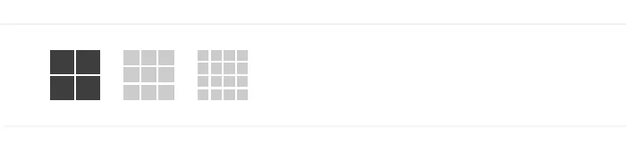
Desktop Grid Size
You can define the default density of the grid using the Default card size setting:
-
Small: Displays more products per row. This view hides secondary elements like swatches or content above the image to create a streamlined, compact look.
-
Medium: A normal, standard view.
-
Large: Displays fewer products per row with larger images.
User-Controlled Resizing
If you enable Allow visitors to resize cards, a toggle will appear in the toolbar on the storefront. This allows customers to switch between Small, Medium, and Large views instantly based on their preference. If disabled, they will be locked into the Default card size you selected.
Mobile Layout
On mobile devices, you can choose between:
-
1 column: Large, full-width cards.
-
2 columns: A compact grid that allows users to see more products at once.
Toolbar & Filters
The toolbar appears directly above the product grid and contains utility options for the customer:
-
Active Filters: Displays currently applied filters as pills. Customers can remove a specific filter by clicking the pill.
-
Sorting: Displays the "Sort by" dropdown (e.g., Price: Low to High, Newest, Best Selling).

You can assign specific color schemes to both the horizontal toolbar and the filter drawer (or sidebar). It is important to note that the toolbar automatically switches to its defined overlay colors when the page is scrolled to ensure visibility. Similarly, the filter drawer will utilize its assigned overlay colors whenever the filters are displayed in a slide-out drawer (which applies to mobile devices and the desktop drawer layout).
To learn how to configure Product Filters, please refer to the Product Filters article.