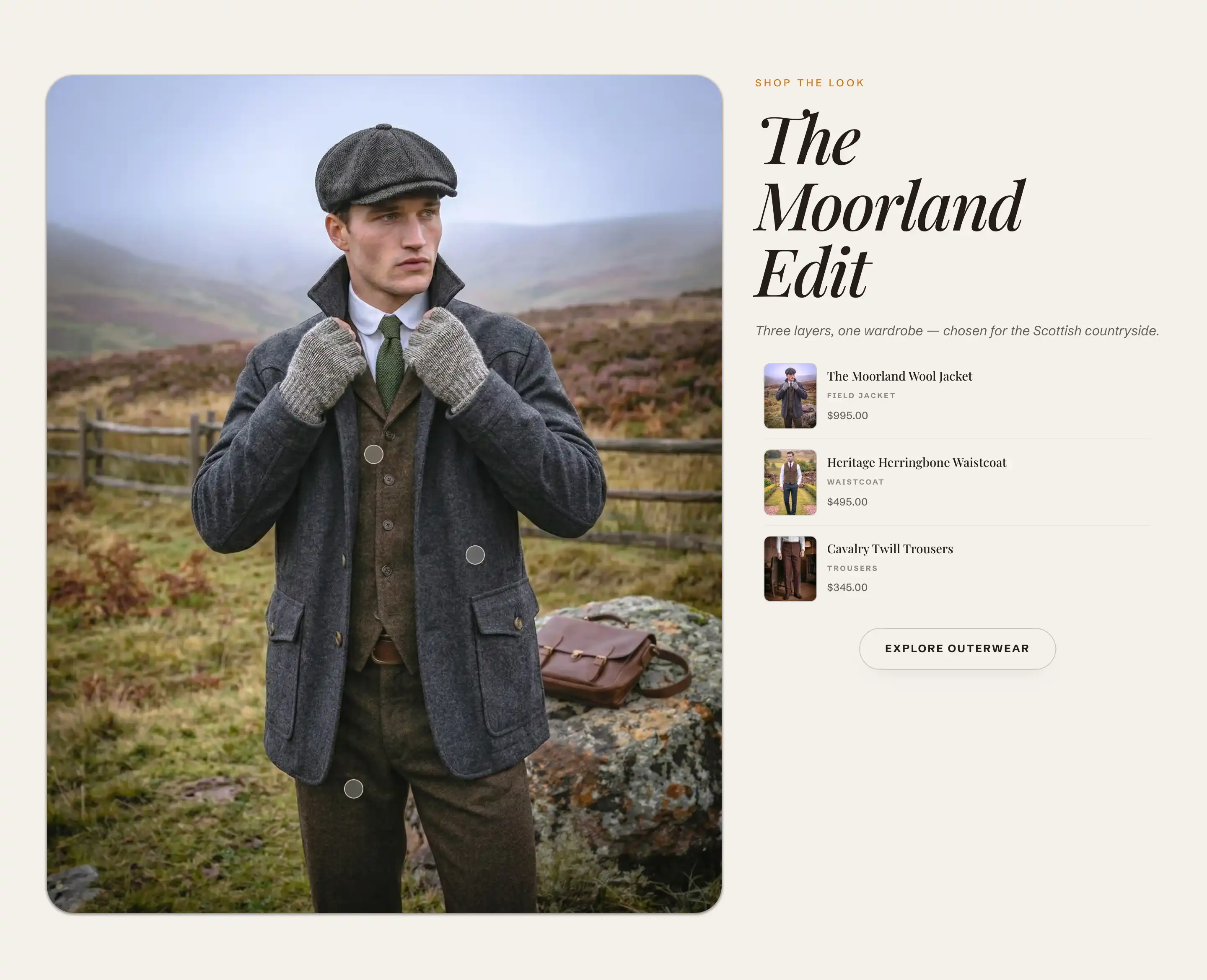
Shoppable image
Shoppable image places one lifestyle photo next to a list of products. Each product gets a dot (a hotspot) on the image, so a shopper can tap a spot in the scene to open that product's card and add it to cart. Add it from Add section under the Products group in the theme editor.
Add the section
- In the theme editor, open the page where you want the section.
- Click Add section and choose Shoppable image. It loads with a heading area, a button, and three hotspots.
- In the section, set Image to your lifestyle photo.
- Click each Hotspot block, assign a Product, and set its position on the image.
Image
- Image: the main lifestyle photo the hotspots sit on. This is the scene shoppers tap. Until you set it, the section shows a placeholder.
- Mobile image: a separate photo for phones. Falls back to the desktop image when not set, so leave it empty unless your main photo is wide and you want a tighter crop for small screens.
Header and Footer
The text beside the image and the button below it live in two content slots you fill with blocks. See Sections, blocks, and groups.
- Header: the intro above the product list. It starts with an eyebrow line, a heading, and a description. Click each block to change its text or remove what you don't need.
- Footer: the area below the list. It starts with a button. Click it to set its label and link, for example a link to the full collection.
Hotspot blocks
Each dot on the image is a Hotspot block. The section holds up to 10. Add or remove them under the section in the block list.
- Product: the product this dot links to. Its image, title, and price fill the card and the matching row in the product list. Until you pick a product, the hotspot shows a placeholder.
- Horizontal position: how far across the image the dot sits, from left (0) to right (100).
- Vertical position: how far down the image the dot sits, from top (0) to bottom (100).
A shopper who taps a dot opens that product's card, and the row in the side list scrolls to match. The price, availability, and the small bag (add to cart) button come from the product you assign. A sold out product shows a sold out label and a disabled bag button.
Common settings
This section also uses the standard Color, Padding, Margin, and Visibility controls. See Common section settings.
Tips
- Place each dot on or near the item it sells so the link between the dot and the product reads clearly.
- The hotspots sit at the same percentage positions on every screen. If your Mobile image crops the scene differently from the desktop Image, check that every dot still lands on its item on mobile.
- Order the Hotspot blocks in the block list the way you want the side list to read, since the rows follow that order.
- Keep the number of hotspots low enough that the dots do not overlap and crowd the photo.