Scroll-driven sections
Reign ships three sections built for long-form stories that respond to scrolling. Each one pairs text with media in its own way. This article covers all three.
- Scrolling content holds a text column in place while a rail of images moves past it.
- Sticky story keeps a full-height image in place while chapter text moves over it.
- Vertical tabs stacks tabs on the left and swaps the panel on the right as the reader clicks through.
Each section is built from blocks. The text, images, and buttons inside come from Reign's shared content blocks, covered in Content blocks reference. This article documents what is unique to each section and its purpose-built blocks.
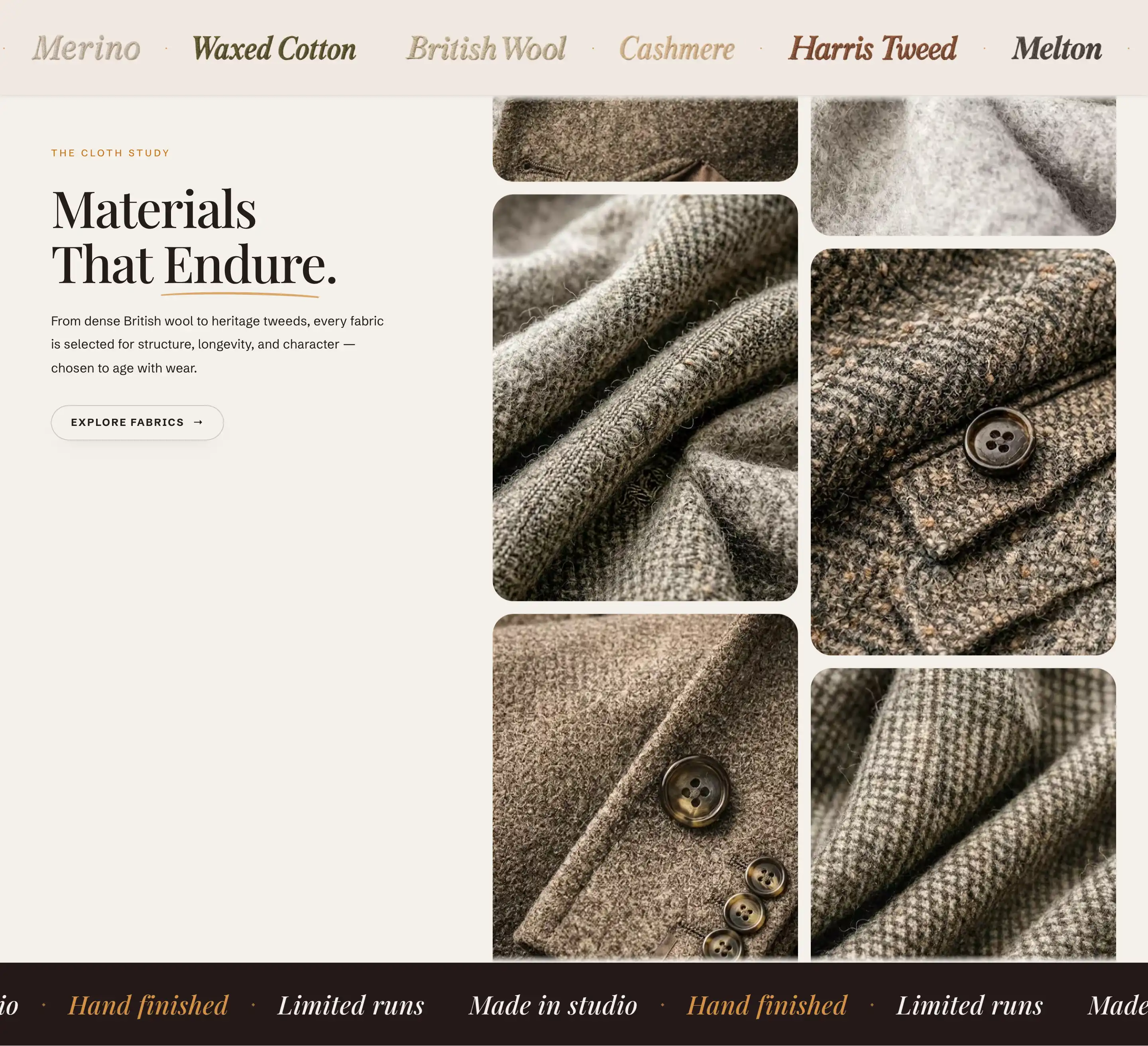
Scrolling content
A two-column layout. One column holds editorial text (an eyebrow, a heading, a paragraph, a button), and the other is a rail of images that scrolls alongside it. A strip of moving text runs above and below the content.
In the editor, Scrolling content appears in the Add section list under the Storytelling group.
Add it
- Open the page you want in the theme editor.
- Click Add section.
- Choose Scrolling content.
- Edit the text and swap the images in the section's blocks.
How it is built
The section comes set up with these blocks in the section's blocks:
- A column of text blocks: Eyebrow, Accent text, Rich text, and Button.
- An Image rail: a content slot that holds the Image blocks scrolling alongside the text. Add or remove Image blocks to change the rail.
- Top marquee and Bottom marquee: the moving text strips above and below the content. Each is a Marquee block (see Content blocks reference).
The number and order of Image blocks in the rail set how the rail reads. There is no count setting: add, remove, or reorder the blocks instead.
Image block
Each Image block in the rail has its own settings under Media.
- Image: the picture for that tile. Left empty, the block shows a placeholder.
- Mobile image: an alternate picture for small screens. It falls back to the desktop image when not set.
The Image block also uses the standard Padding controls. See Common section settings.
Settings
The section adds one control of its own, under Layout.
- Pin text column on scroll: holds the text column in place while the images scroll past it. Off makes both columns scroll together.
This section also uses the standard Color, Padding, Margin, and Visibility controls. See Common section settings.
Sticky story
A full-height section where a background image or video stays in place while chapter text scrolls over it. Each chapter is its own block, so the media and the copy can change as the reader moves down the page.
In the editor, Sticky story appears in the Add section list under the Storytelling group.
Add it
- Open the page in the theme editor.
- Click Add section.
- Choose Sticky story.
- It starts with three chapters (Chapter one, Chapter two, Chapter three). Edit each, or add more with Add block.
Chapter block
Each Chapter block holds its own background media and a stack of content blocks (an eyebrow, a heading, prose, a button, a separator, a metric). Its own settings:
Media
- Media type: Image or Video for the chapter background.
- Image: the background picture, shown when Media type is Image.
- Mobile image: an alternate background for small screens, shown when an Image is set. It falls back to the desktop image when not set.
- Video: the background clip, shown when Media type is Video. Supply your own file. The background does not fill from a product.
Layout
- Alignment: place the chapter text to the Left or Right over the media.
- Enable side gradient: adds a gradient behind the text so it reads against a busy image.
- Show number: shows the chapter's number.
The chapter count is read from how many Chapter blocks the section has. Add or remove blocks to change the story.
Metric block
The default first chapter includes a Metric block, a figure with a label under it. It has two fields:
- Value: the figure.
- Label: the line under it.
Settings
This section uses the standard Color, Padding, Margin, and Visibility controls. See Common section settings.
Vertical tabs
A row of tabs down the left side with a content panel on the right. Click a tab and its panel swaps in. On small screens the panels reflow into an accordion. A section header (eyebrow, heading, subtitle) sits above the tab list.
In the editor, Vertical tabs appears in the Add section list under the Storytelling group.
Add it
- Open the page in the theme editor.
- Click Add section.
- Find Vertical tabs under Storytelling and choose it.
- It starts with a header and three tabs (Tab one, Tab two, Tab three). Edit each, or add more with Add block.
The header above the tab list is a static content slot named Header. Edit its eyebrow, heading, and subtitle blocks like any other content.
Tab block
Each Tab block is one entry in the tab list plus the panel it opens. The panel holds its own content (by default an Editorial images block with a button inside). Its own settings:
Tab
- Title: the main label in the tab list.
- Caption: a short line under the title.
- Description: a longer supporting line that shows when the tab is open.
The tab also has a Color group with Inherit color scheme (on by default, so the panel uses the section's colors) and a Color scheme that appears when you turn inheritance off, plus the standard Padding controls for space inside the panel. See Common section settings.
Settings
This section uses the standard Color, Padding, Margin, and Visibility controls. See Common section settings.
Tips
- These sections read their layout from the number and order of their blocks. Reorder or remove Image, Chapter, or Tab blocks to change the story instead of looking for a count setting.
- When chapter text in Sticky story struggles against a busy image, turn on Enable side gradient for that chapter before reaching for a darker color scheme.
- If the header menu washes out over a dark section image, turn on Use dark header theme over this section in the section's Color group.