Product cards
Product cards are the tiles that show a product wherever Reign lists products: collection grids, search results, featured collections, and related products. The Product cards panel in Theme settings sets how every card looks across the store, so you set it once instead of per section.
Where to find it
- In the theme editor, open Theme settings.
- Select Product cards.
- Change any setting, then Save. The change applies to every product card on the storefront.
Settings
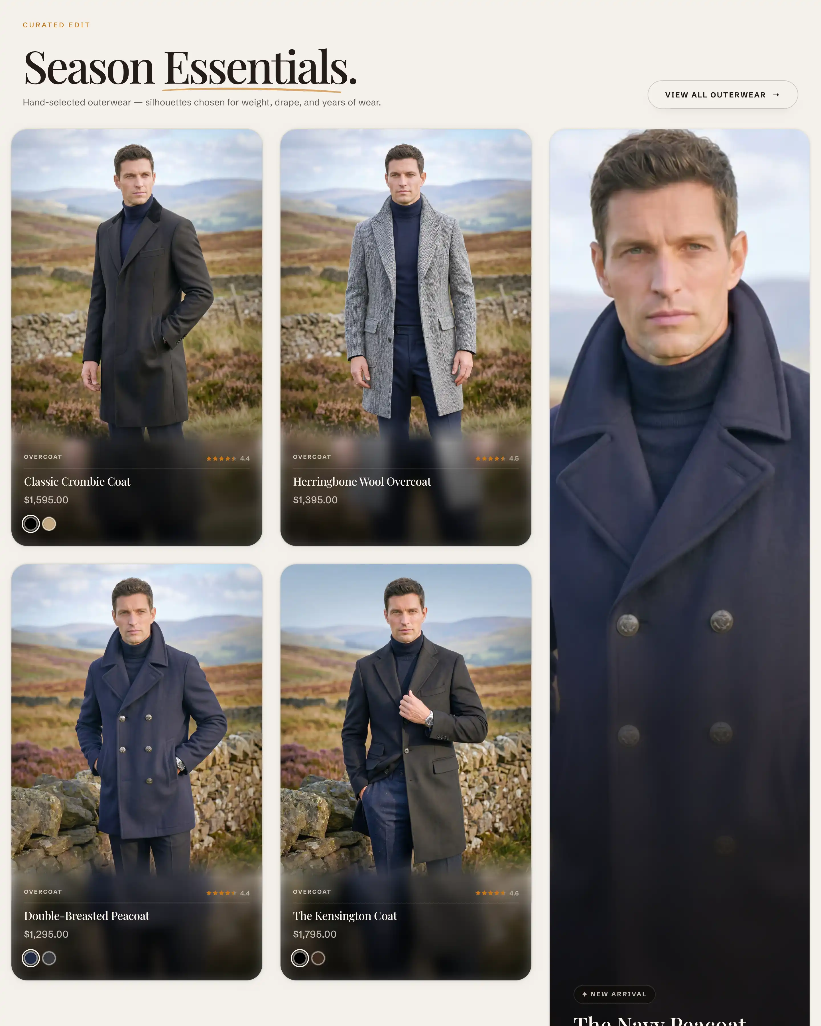
These controls sit at the top of the panel, above the first heading.
- Image ratio: the shape of the product photo on the card. Adapt to image keeps each photo's own proportions. The rest crop every photo to a fixed shape: Portrait (4:5), Tall (2:3), Square (1:1), or Landscape (3:2). A fixed ratio keeps every card the same height in a row, which lines the grid up.
- Card style: how the card frames the product details. Overlay places the title, price, and details in a panel over the photo, which Reign tints to match the image. Plain puts the photo on top and the details in a block below it.
- Corner radius: how round the card corners are, in pixels.
- Content padding: the space between the card edge and its content, in pixels.
Hover overlays
- Show image indicators: shows a thin bar at the bottom of the image. A shopper hovers the bar to scrub through the product's other photos without opening the product.
- Show size pills: shows the product's available sizes as small pills on the card.
- Size option name: tells the card which Shopify variant option holds sizes. It matches a variant option by name, for example Size. Set it to the exact option name your products use. This appears only when Show size pills is on.
Quick add
- Show quick add button: adds a button on the card that lets shoppers add the product without opening its page.
- Show quick add on mobile: also shows that button on phones. It is off by default, since the button relies on hover on desktop. This appears only when Show quick add button is on.
Card content
- Label source: the small eyebrow label above the product title. Choose Vendor, Product type, Category, or None to hide it. The text comes from that field on each product.
- Label size: the label's text size, Extra small or Small.
- Uppercase label: shows the label in capital letters.
- Rating text: the value shown next to the review stars. Average shows the average score, Count shows how many reviews there are, or None shows stars only. Ratings come from a review app or a metafield on the product.
- When no reviews: what a card shows when a product has no reviews yet. Hide removes the stars, Dimmed stars shows them greyed out.
Tips
- Label source and the rating read product data, not card text. The label pulls from each product's vendor, type, or category, so fill that field for the label to show. If a product has no review data, the stars stay empty (or follow When no reviews) no matter what you pick.
- A single product card can override Card style for one placement. In a card's own block settings, leave its Card style on Inherit to follow this panel, or set Overlay or Plain to differ.
- Show size pills only works when Size option name matches one of the product's variant option names exactly. If pills never appear, check that the name here is spelled the same way as in your products.