Media card slider
Media card slider is a horizontal carousel of editorial cards. Each card carries its own image or video, an overlay, and stacked content (eyebrow, heading, text, button). It suits lookbooks, category highlights, or campaign callouts. Add it from Add section under the Media group. It cannot go in the header, footer, or overlay groups.
Add the section
- Open your store theme in the Shopify theme editor.
- Pick the page where you want the slider (for example, the home page).
- Click Add section.
- Choose Media card slider.
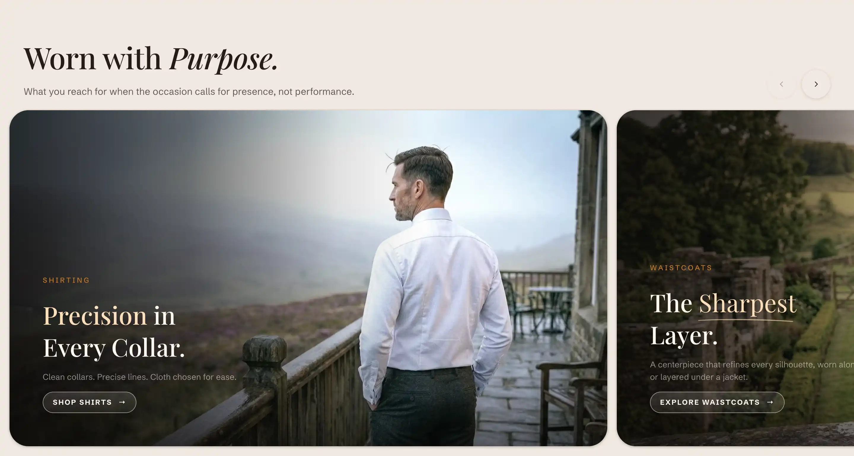
The section starts with a header content slot and three sample Slide blocks. Click a slide in the section's blocks to edit it, or use Add block to add another Slide. The header content slot holds your title and intro text as ordinary blocks. For how slots and blocks fit together, see Sections, blocks, and groups.
Section settings
These control the slider as a whole. Per-card content lives on each Slide block (below).
Layout
- Slides per view: how many cards show side by side on desktop, from 1 to 4. On narrow screens the carousel falls back to a single card you swipe through.
- Gap: the space between cards in pixels, from 0 to 32.
- Aspect ratio: the shape every card uses on desktop. Pick Wide (16:9), Landscape (3:2), Portrait (4:5), or Square (1:1). This applies to all cards, so it is the one place to change card proportions for the whole slider.
This section also uses the standard Color, Padding, Margin, and Visibility controls. See Common section settings.
Slide settings
Each Slide block holds one card. Open a slide to set its media, overlay, and layout. The text inside a slide (eyebrow, heading, paragraph, button) comes from blocks you add within the slide, so you control the wording and order there.
Background
- Media type: choose Image or Video for the card background.
- Image: the desktop background image. Shown when Media type is Image.
- Mobile image: an optional image for small screens. It falls back to the desktop image when not set. Shown when Media type is Image.
- Video: the background video. It autoplays muted and loops. Shown when Media type is Video.
Overlay
The overlay is a tint over the media that keeps text readable.
- Overlay: choose None, Solid, or Gradient.
- Color: the tint color and opacity for a solid overlay. Shown when Overlay is Solid.
- Overlay opacity: how strong the gradient tint is, from 0 to 100 percent. Shown when Overlay is Gradient.
Layout
- Content position: where the text sits on the card. Nine options run from Top left through Middle center to Bottom right.
- Text alignment: align the text Left, Center, or Right.
- Content width: the maximum width of the text block on the card, from 320 to 960 px.
A slide also uses the standard Color, Padding, and Margin controls. See Common section settings. The slide ships with separate desktop and mobile padding turned on, so you will see a Desktop padding and a Mobile padding group from the start.
Tips
- The first slide loads its video right away. Later video slides defer their download until you swipe to them, so put the slide you most want seen first.
- Card shape comes from the section's Aspect ratio, not the slide. Change it on the section to reshape every card at once.
- The navigation arrows appear only when the slider holds more than one slide.
- A slide with no image or video shows a placeholder graphic, so an empty slide will not break the layout while you build.
Media card block
The Media card block is a related single-card block you add inside other container sections, not inside this slider's Slide. It pairs one image or video with stacked text and an optional link. Its settings mirror the slide with a few additions:
- A Media group (Media type, Image, Mobile image, Video).
- Aspect ratio with the four shapes above plus Adapt to image and Custom (which reveals a Custom ratio field, for example
16/9). - Overlay style: Gradient or Caption bar, with Overlay strength when set to Gradient.
- Link, which makes the whole card clickable.
It also uses the standard Color, Padding, and Margin controls. See Common section settings.