Footer
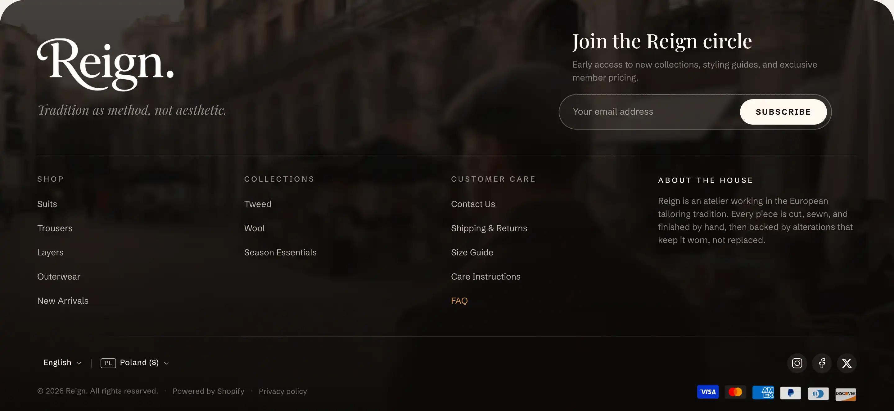
The footer is the band at the bottom of every page. It holds two parts: a content area you fill with blocks (menus, an email signup, your logo, text) and a bottom row the section builds for you (locale selectors, social icons, payment icons, copyright, and policy links).
The footer lives in the Footer section group, not in the Add section list. Reign limits the store to one footer, so you edit the existing one.
Open the footer
- In the theme editor, open the section list on the left.
- Find the Footer group near the bottom and click Footer to open its settings.
- To change what shows in the content area, expand the section's blocks and edit the blocks nested under it (a Menu, an Email signup, a Group, and so on).
Footer settings
These settings control the section as a whole. The content above the bottom row comes from blocks, covered further down.
Background
- Background media: what sits behind the footer. None, Image, or Video. The next fields appear based on this choice. With an image or video set, the footer switches to light text for readability.
- Background image: the image behind the footer. Shows when Background media is Image.
- Background video: the video behind the footer. Shows when Background media is Video.
- Overlay opacity: darkens the media so text stays legible. Higher values darken more. Shows when Background media is not None.
Country/region selector
- Show country/region selector: lets shoppers switch country or region in the footer. It appears on the storefront only when your store has more than one country or region in market settings.
- Show country code: adds the two-letter country code next to the region name. Shows when Show country/region selector is on.
Language selector
- Show language selector: lets shoppers switch language in the footer. It appears only when your store has more than one published language.
Social icons
These two controls style the social row. The links come from theme settings (see Tips), so there are no link fields here.
- Icon style: Outline or Pill.
- Icon size: the icon size in pixels.
Payment methods
- Show payment icons: shows icons for the payment methods your store accepts. They appear only when at least one payment method is enabled.
Policy links
- Show policy links: shows links to your store policies (refund, privacy, terms, and so on). Each appears only once you have written that policy in your store policy settings.
Copyright
- Copyright text: your copyright line. Leave it blank to use the automatic line, which fills in the current year and your store name.
- Show "Powered by Shopify": adds the "Powered by Shopify" credit next to the copyright.
This section also uses the standard Color, Padding, and Margin controls. See Common section settings.
Blocks inside the footer
The content area above the bottom row is built from blocks. Any block can go here, arranged with groups. These three carry footer-specific behavior worth calling out.
Menu
Shows a column of links from one of your store navigation menus. It renders the top level of the chosen menu as a flat list and ignores any nested items.
- Menu: which store menu to show.
- Heading: the text above the link column. Leave blank to hide it.
- Heading style: Default or Eyebrow (a small uppercase label).
- Heading size: Small, Base, or Large. Shows when Heading style is Default.
- Gap: the space between the links.
- Link emphasis: link contrast, Normal, Muted, or Faded.
- Inherit color scheme: keeps the footer's color scheme. Turn it off to set a Color scheme for this column alone.
The Menu block also uses the standard Padding controls. See Common section settings.
Email signup
A newsletter form that collects email addresses. New subscribers are tagged as newsletter, so you can find them in your customer list.
- Email placeholder: the hint text inside the email field.
- Button label: the text on the submit button.
- Success message: the text shown after someone subscribes.
- Style: Default (a pill input with a button) or Editorial (a slim underlined row with an arrow).
- Small text below form: an optional note under the form, for example a privacy line.
- Alignment: aligns the form Left, Center, or Right.
- Max width: the widest the form can grow, in pixels.
The Email signup block also uses the standard Margin controls. See Common section settings.
Social icons
A row of social media icons. It has no link fields of its own: it reads the same links as the footer's built-in social row (see Tips).
- Alignment: aligns the icons Left, Center, or Right.
The Social icons block also uses the standard Margin controls. See Common section settings.
Tips
- Social links are not set on the section or the block. Open Theme settings, go to the Social media panel, and fill in the URL fields (Instagram URL, Facebook URL, and so on). Only the platforms you fill in show an icon. The footer's social row and the Social icons block both read these same links, so you enter them once.
- The country/region selector, language selector, payment icons, and policy links appear only when the matching store data exists. If one is missing on the storefront, check your market settings, published languages, enabled payment methods, or written store policies.
- Leave Copyright text blank to let the year update on its own. The automatic line fills in the current year and your store name.