Display list
Display list is a section that presents named items in two stacks, one above and one below a center statement line, with a decorative illustration behind the rows. Each row reveals a photo when a visitor hovers or focuses it. It appears in Add section under the Storytelling group, and cannot be added to the header, footer, or an overlay section group. For how sections and blocks fit together, see Sections, blocks, and groups.
Add the section
- Open your theme in the Shopify theme editor.
- Pick the page where you want the list.
- Click Add section, then choose Display list.
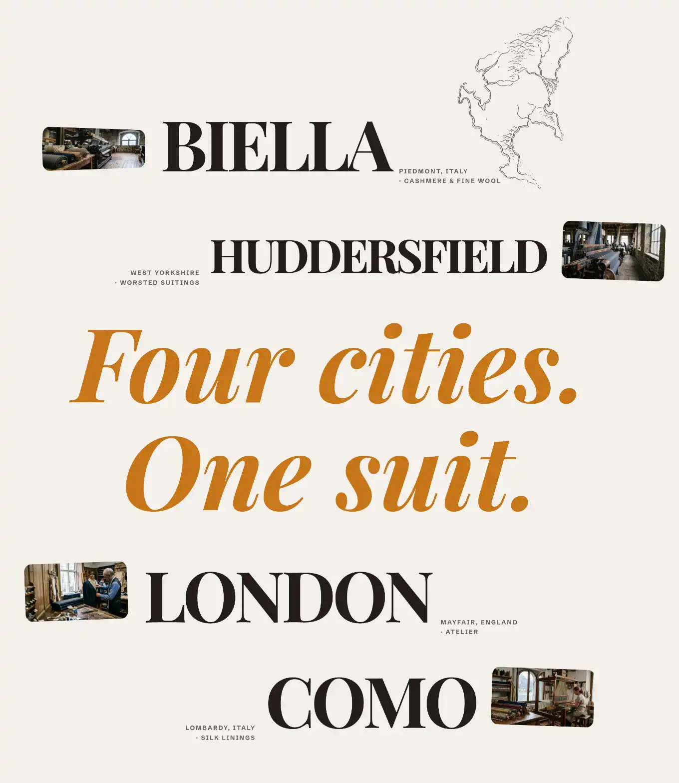
The section starts with four items: two in the Above stack, two in the Below stack, a center Manifest line, and an Illustration behind the rows.
The section's blocks
Under the section in the block list you see four nested blocks:
- Illustration: a decorative graphic that sits behind the rows.
- Above: the top stack of rows.
- Manifest: the center statement line between the two stacks.
- Below: the bottom stack of rows.
Above and Below are stacks. You add Item blocks inside each one. A row's position (top or bottom) comes from which stack holds it, so an item has no setting for that.
Add or edit items
- In the block list, open Above or Below.
- Click Add block, then choose Item.
- Set the item's fields (below).
- Drag items inside the stack to reorder them.
Item settings
Each Item is one row. Click an item in the block list to edit it.
- Title: the main text of the row. It is the largest text and drives the row's size, so a shorter title renders larger.
- Caption first line: the first line of the small label next to the title.
- Caption second line: a second small label line. Leave it empty to show only the first line.
- Image: a photo for this row. It stays hidden until a visitor hovers or focuses the row, then it follows the pointer. Leave it empty for a text-only row.
- Label side: which side the caption label sits on. Choose Right or Left.
Manifest settings
Manifest is the center statement between the two stacks. Click it in the block list to edit it.
- Text: the statement line shown in the middle of the section.
- Hover cursor image: an image that follows the pointer over the center of the section. Leave it empty to skip it.
Illustration settings
Illustration is the static graphic behind the rows. The default ships a built-in drawing marked Decorative. Click it in the block list to edit it.
- Illustration: pick the drawing from the grouped list (for example Suit, Map, Mountains).
- Decorative: keep this on when the drawing is purely visual, so screen readers skip it. Turn it off to give it alternative text.
- Size: the height as a percentage of the standard height. Every illustration shares the same height at a given value, so a row of them lines up.
- Use a different size on mobile: turn on to set a separate Mobile size for phones.
- Its ink color follows the section text by default (Text (auto)). Switch to Custom to pick a fixed color.
The Illustration block also uses the standard Margin controls. See Common section settings.
Section settings
This section uses the standard Color, Padding, Margin, and Visibility controls. See Common section settings.
Tips
- Titles set the visual weight of a row. A short Title renders large, a long one renders smaller. Use that to control which rows stand out.
- Row photos appear only on hover or focus, so they are not visible on first load. Set an Image when you want a reveal on interaction, and leave it empty for a clean text row.
- Switch a row's caption to the other side with Label side when one side feels crowded.
- The default ships two items in Above and two in Below. Add or remove items in either stack to balance the two halves.