Contact page and form
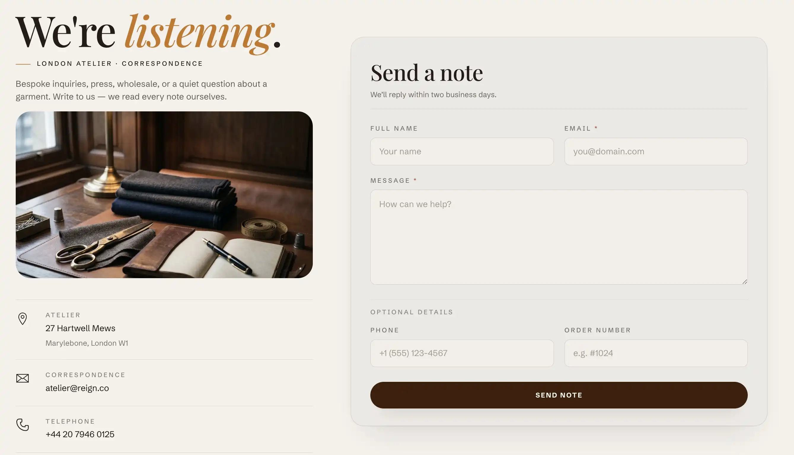
The Contact section pairs a working contact form with an info column where you list your email, phone, and address. It uses Shopify's built-in contact form, so submissions reach the email set in your store's general settings. It is the main section of a page that uses the contact template.
Create the contact page
If you already have a contact page, skip ahead.
- In Shopify admin, go to Online Store > Pages.
- Click Add page and give it a title (for example, Contact).
- In the Theme template box, choose contact.
- Click Save, then add the page to a menu under Online Store > Navigation so customers can reach it.
Open the section in the editor
- Open the theme editor and use the top page selector to switch to your contact page.
- In the section's blocks, click the Contact section to open its settings.
The section has two parts: an info column (a Header content slot plus contact rows) on one side, and the form on the other.
Edit the intro text
The form's own heading and helper line are fixed theme text and are not section settings. The editable intro that sits above the contact rows lives in the Header content slot in the info column.
Under the Contact section, open the Header content slot and edit its blocks (an eyebrow line, the heading, a signature line, and an intro paragraph). For how content slots work, see Sections, blocks, and groups.
Add and edit contact rows
Each line in the info column (email, phone, address, and so on) is a Contact ledger row block. You can add up to six rows.
- Under the Contact section, click Add block and choose Contact ledger row.
- Fill in the settings below.
- Drag rows in the block list to reorder them. To remove one, select it and delete it.
Contact ledger row settings:
- Icon: the symbol shown next to the row, picked from grouped sets (Service & contact, Store & location, and Payments). Choose an envelope for email, a phone for phone, a pin for an address.
- Label: the small caption above the value (for example, Email, Phone, or Address).
- Value: the main text of the row (the address, number, or email itself).
- Link: makes the value clickable. Use a
mailto:address for email, atel:number for phone, or any URL for a map link. Leave it empty to show the value as plain text. - Secondary line: an optional second line under the value, useful for a city and postal code or a suite number.
Form
These settings control which fields appear in the contact form.
- Show phone field: adds an optional phone number field. Turn it off if you do not want to collect phone numbers.
- Show order number field: adds an optional order number field, useful when most messages are about existing orders. Turn it off to keep the form short.
The Name, Email, and Message fields always show. Email and Message are required to submit.
This section also uses the standard Color, Padding, Margin, and Visibility controls. See Common section settings.
Tips
- Where replies go: Shopify sends form submissions to the store contact email under Settings > General, not to anything in this section. Set that address before you launch the page.
- A clickable email or phone row needs the right prefix in Link. Without
mailto:ortel:, the entry opens as a web address and does nothing useful. - After a customer sends a message, the form swaps to a confirmation in place, so they stay on the same page.