Collage
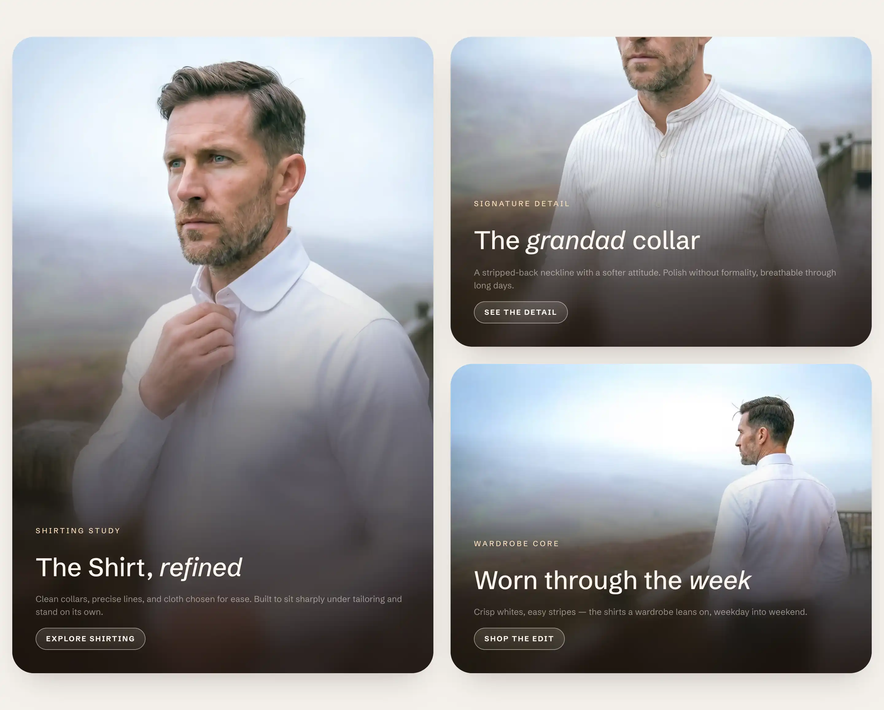
Collage arranges a set of media cards into a grid: one large feature card with smaller cards around it, or an even mosaic. Each card holds an image or video with its own heading, text, and link. It is a preset of the flexible Section, so it shares the standard section controls.
Add a Collage
- In the theme editor, open the page you want to edit.
- Click Add section.
- Under Storytelling, choose Collage.
The section arrives with a Collage block holding three Media card blocks. The cards show placeholders until you add an image to each one.
The Collage block
Select the Collage block in the section's blocks to set how the cards are arranged. Its settings sit under two headings.
Layout
- Layout: how the cards are placed.
- Featured left, Featured right, Featured top, Featured bottom: one large card with two smaller cards beside or below it. The name says where the large card sits. These use the first three cards in the block list.
- Two columns: an even grid built from four cards.
- Three columns: a row of three cards.
- Size: Normal or Compact. Compact tightens the cards for a smaller block.
- Gap: the space between cards, in pixels.
The layout decides how many cards fill the grid. Add or remove Media card blocks to match: three for the featured layouts and Three columns, four for Two columns. Extra cards wrap to a new row.
Size
- Width: Fill spans the section edge to edge, Page matches the standard content width, and Custom sets your own. Custom adds Max width in pixels.
- Minimum height: Fit sizes to the cards. Pixels sets a fixed grid height. Percent sets the height as a share of the screen, for a tall block.
This block also uses the standard Color, Padding, Margin, and Visibility controls. See Common section settings.
Each Media card
Each card is a Media card block under the Collage block. Select one to set its image and content.
Media
- Media type: Image or Video.
- Image: the card image. Shown when Media type is Image.
- Mobile image: an optional image for phones. Falls back to the desktop image when not set.
- Video: the card video. Shown when Media type is Video.
- Aspect ratio: the card shape. Adapt to image follows the image's own proportions. The rest are fixed: Square (1:1), Portrait (4:5), Landscape (3:2), Wide (16:9), or Custom.
- Custom ratio: your own ratio (for example
16/9or1.5). Shown when Aspect ratio is Custom. - Overlay style: how text sits over the media. Gradient fades the lower edge dark so text reads over the image. Caption bar places the text in a band below the image.
- Overlay strength: how dark the gradient is behind overlaid text. Shown when Overlay style is Gradient.
- Link: a destination for the card. Set it to make the whole card clickable.
Card content
The heading, text, and any button live as blocks inside the card. Add, reorder, or remove them under the Media card in the block list. See Sections, blocks, and groups.
This card also uses the standard Color, Padding, and Margin controls. See Common section settings.
Common settings
The Collage section also uses the standard Color, Layout, Size, Appearance, Border, Padding, Margin, and Visibility controls. See Common section settings.
Tips
- Over-image text stays readable through each card's Overlay style, not its color scheme. Gradient darkens the lower edge of the image so light text reads on top.
- Give the cards in one collage a consistent Aspect ratio so the grid lines up. Mix ratios only when you want an irregular look.
- Use Caption bar when the image is busy and a gradient would not give enough contrast for the text.