Buttons
A Button is a block you add inside a section to send shoppers somewhere: a collection, a product, or any page. Each button you place has its own settings.
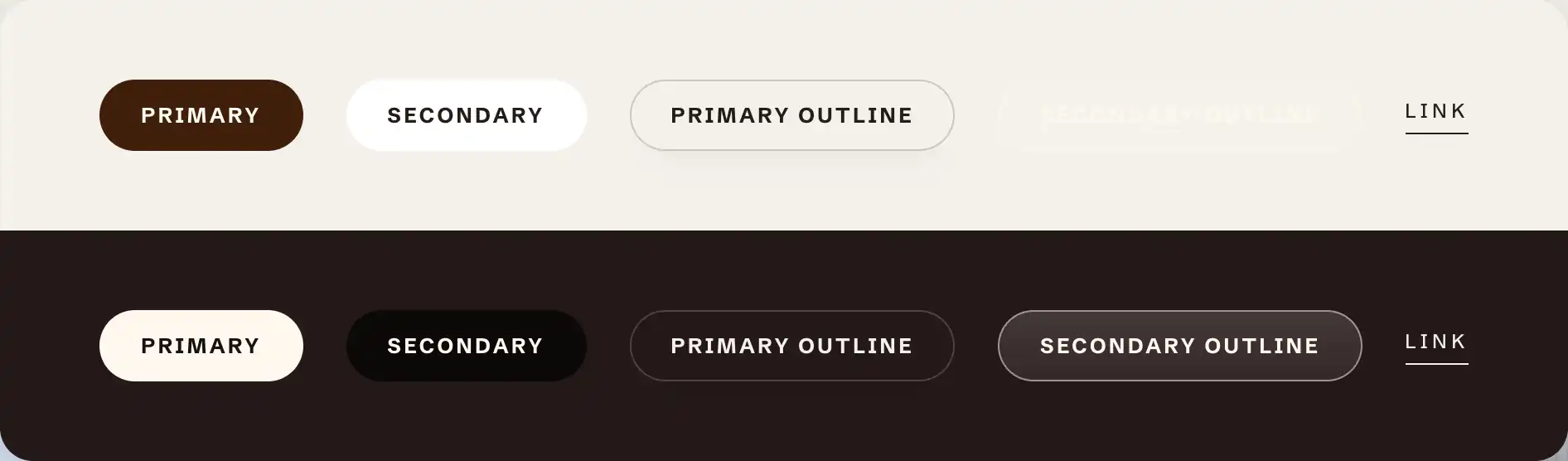
The primary styles are built to read on light backgrounds. The secondary styles are tuned for dark or over-image backgrounds: a secondary outline can be nearly invisible on a light section and only reads well on a dark one. Match the style to the section's color scheme.
Add a button
- In the theme editor, select the section you want the button in.
- Click Add block and open the Basic group.
- Choose Button.
Settings
- Label: the button text. The default is "Shop now".
- Link: where the button goes. With no link it renders as a plain button with no action.
- Style: the look of the button.
- Primary: the solid, high-emphasis button.
- Secondary: a lower-emphasis solid button.
- Primary outline and Secondary outline: outlined versions of each.
- Link: text with no button shape, for an inline call to action.
- Size: Small, Medium, or Large. Hidden when Style is Link.
- Show arrow: adds an arrow after the label that nudges forward on hover.
Desktop size and Mobile size
- Width: how the button is sized. Fit hugs the label, Percent sets a share of the space, and Pixels sets a fixed width. Percent and Pixels add a Custom width control.
The button also has Margin controls (top and bottom) to space it from the blocks around it.
Button label casing
The casing of every button label is set once for the whole store, under Theme settings > Buttons.
- Text transform: None shows labels as typed, Uppercase renders them in all capitals (the default), Lowercase in all lowercase, and Capitalize with the first letter of each word in capitals. It changes the display only, so you can switch casing at any time without retyping.
Tips
- Use one Primary button per section as the main action. Extra primary buttons compete and dilute the call to action. Reach for Secondary, an outline, or Link style for the rest.
- For two buttons side by side, put them in a Group set to a horizontal direction. See Sections, blocks, and groups.