More product info blocks
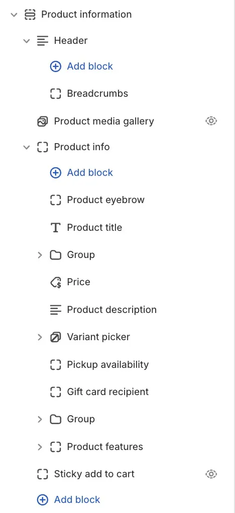
Beyond the title, price, and description covered in Product page layout and blocks, the product info column accepts a set of smaller blocks. Each one reads from the page's product automatically (the editor marks them "Connected to the parent product"), so there is nothing to pick: add the block, place it in the stack, and it fills itself.
You add each one the same way: select the Product information section, expand Product info, click Add block, and pick the block from the Products group. Every block here also uses the standard Margin controls. See Common section settings.
Product eyebrow
A short label above the title, in small type: the product's category, vendor, or your own text.
- Text source: where the label comes from. Collection or type (auto) uses the product's collection when there is one and falls back to its type. Collection title, Product type, and Vendor each pin one source. Custom text shows the text you type below.
- Custom text: the label to show. Used when Text source is Custom text.
- Uppercase: sets the label in capitals.
Product rating
The product's star rating with an optional average and review count. The block reads the rating your product reviews app saves on the product, so it needs a reviews app to show anything.
- Show average rating: prints the numeric average next to the stars.
- Show review count: prints how many reviews the rating is based on.
- Reviews link: clicking the rating scrolls to your reviews section. Enter its anchor, e.g. #reviews. Left empty, it defaults to #reviews.
SKU
The SKU of the selected variant. When the shopper switches variants, the SKU follows.
- Prefix: the text printed before the number. The default is "SKU ". Clear it to show the bare value.
Product tags
The product's tags as a row of small labels.
- Max tags: how many tags to show at most.
- Link to search: makes each tag clickable, leading to the search results for that tag.
Pickup availability
Shows whether the selected variant is available for pickup at your locations, with the store name and a link to see all locations. It requires Shopify pickup locations: set them up in your Shopify admin under Settings, then Locations. With no pickup locations configured, the block stays empty.
Product disclosures
An expandable row with the safety and compliance details saved in the product's metafields (the fields Shopify provides for EU product compliance). The block shows only when the product has disclosure data; products without it render nothing.
- Heading: the row's title. The default is "Product disclosures".
- Open by default: shows the row already expanded when the page loads.
Follow on Shop
A button that lets shoppers follow your store in the Shop app, so your new products and offers show in their feed. For the button to be visible, the Shop channel must be installed and Shop Pay activated.
- Alignment: Left, Center, or Right.
Tips
- These blocks stay empty rather than break when their data is missing: no reviews app means no rating, no tags means no tag row, no pickup locations means no pickup note. If a block seems to do nothing, check the data source first.
- Product eyebrow on Collection or type (auto) is the safe default for a catalog with mixed categorization; pin a single source only when every product has that field filled.
- Keep Max tags low. Tags are navigation hints, not content; three to five read well above or below the description.