Pop-up
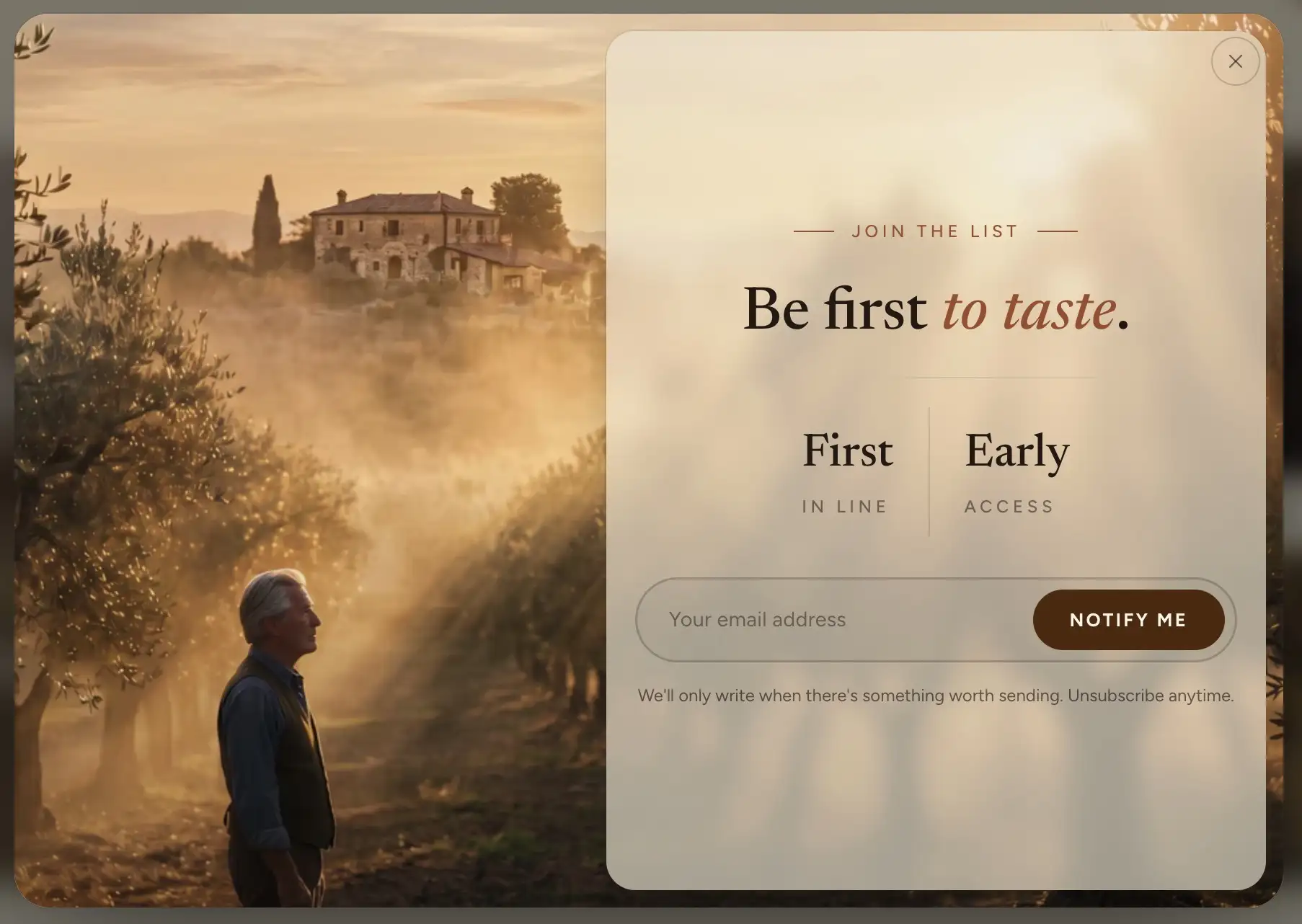
The Pop-up is a dialog that opens over the page: a newsletter signup, a promotion, an announcement. You fill it with the same content blocks you use anywhere else, choose what makes it open, and set how often it may reopen for the same visitor. A shopper closes it with the close button or the Escape key.
Add the section
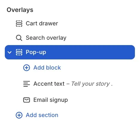
The Pop-up lives in the Overlays group, which sits at the bottom of the section list on every page.
- In the theme editor, expand Overlays at the bottom of the sidebar.
- Click Add section inside the group and choose Pop-up (under Promotional).
- Select the section to preview it in the editor while you style it.
A store can have one Pop-up. It arrives with an Accent text heading and an Email signup block, ready to use as a newsletter signup. Swap or extend those with your own blocks: the Pop-up accepts the standard content blocks (text, image, buttons, and so on). See Content blocks reference. The Email signup block is the same one the footer uses: see Footer.
Trigger
These settings decide when the pop-up opens and for whom.
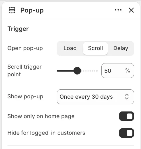
- Open pop-up: what triggers it. Load opens it when the page loads. Scroll opens it once the shopper scrolls far enough down the page. Delay opens it after a timer.
- Delay: the wait in seconds before the pop-up opens, from 0 to 30. Shown when Open pop-up is Delay or Load.
- Scroll trigger point: how far down the page the shopper must scroll before the pop-up opens, from 10 to 90 percent. Shown when Open pop-up is Scroll.
- Show pop-up: how often the pop-up may open again for the same visitor, from Once every hour to Once per year. The default is Once every 30 days. Once a visitor has seen it, it stays away until the chosen period passes.
- Show only on home page: limits the pop-up to the home page. On by default. Turn it off to let it open on any page.
- Hide for logged-in customers: keeps the pop-up away from shoppers with a customer account who are signed in. On by default.
Appearance
- Size: the dialog width, Small or Medium.
- Color scheme: the colors for the dialog surface and its content.
The section also uses the standard Padding controls, including separate mobile paddings. See Common section settings.
Tips
- Show pop-up is the setting that keeps a pop-up polite. A visitor who has already seen it will not see it again until the period passes, so a longer interval reads as less pushy.
- For a newsletter pop-up, Scroll with a trigger point around 50 percent tends to interrupt less than Load: the shopper has shown interest before you ask for their email.
- While testing, remember the frequency cap applies to you too. If the pop-up does not reopen on the storefront, you have most likely seen it within the chosen period; check it in the theme editor instead, where it always shows.
- Keep the content short. One heading, one line of text, and one action fit the small dialog; a long stack of blocks forces the dialog to scroll.