Sections
The Freedom theme is built entirely on the powerful Shopify Theme blocks architecture. Unlike traditional themes where sections have rigid structures, Freedom utilizes the full flexibility of Theme blocks to allow you to construct unique layouts using nested modular elements.
At the core of the theme lies a versatile component simply named Section. This element serves as a blank canvas and gives you the freedom to arrange any available blocks like text, images, and buttons exactly how you envision them.
When you select options like Contact Form, Image Banner, or FAQ, you are essentially utilizing pre-configured presets of the master Section (internally section.liquid). While they come with default settings for convenience, they operate within the same flexible structure.
However, not all sections in the theme utilize this single generic file. You can read more about these distinct layouts under the Specialized sections structure heading below.
Settings
Because most sections share this same foundation, you will find a consistent set of controls across the theme:
Layout
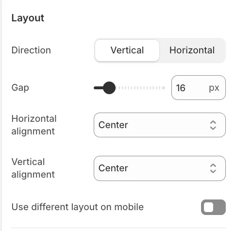
This determines how the blocks inside the section are arranged.
-
Direction: Choose Vertical (Column) to stack blocks or Horizontal (Row) to place them side-by-side.
-
Gap: Controls the spacing between elements.
-
Alignment: Controls how content is positioned (e.g., Center, Left, Stretch) vertically or horizontally.
-
Mobile Layout: You can toggle Use different layout on mobile to completely change the direction and spacing for smaller screens (e.g., Row on Desktop, Column on Mobile).
Size
-
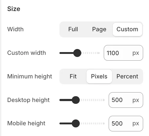
Width:
-
Full: Spans the entire screen edge-to-edge.
-
Page: Constraints content to the standard site width.
-
Custom: Allows you to define a specific max-width in pixels.
-
-
Minimum Height:
-
Fit: The section shrinks to fit its content.
-
Screen: Sets height as a percentage of the user's viewport (e.g., 100% for a full-screen hero).
-
Appearance
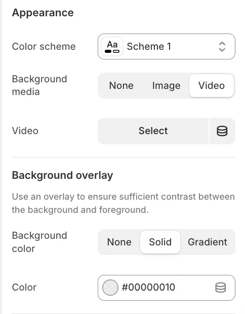
-
Background media: You can assign an Image or Video as the background for the entire section.
-
Overlay: Apply a solid color or gradient over the background media to ensure text readability.
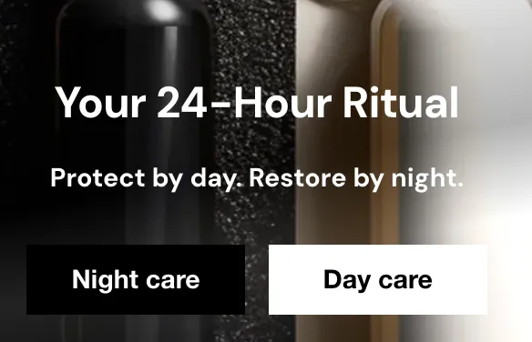
Specialized sections structure
Sections like Scrolling Content, Hero Slideshow, or Testimonials utilize a unique nested structure. This architecture allows you to wrap complex functionality with standard content blocks.
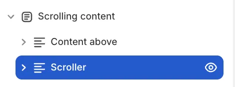
The Structure:
-
The Parent Section handles the background, width, and padding for the whole area.
-
Content Above (Header) is a dedicated slot where you can add standard blocks like Headings and Subheadings that appear before the main feature.
-
The Main Block contains the specific settings for the feature (e.g. Scroll Speed, Slider logic).
-
Content Below is the empty space at the bottom that allows you to add extra blocks like buttons that sit below the main feature.
This arrangement allows you to apply a single unified background that seamlessly covers all these elements while utilizing consistent layout and spacing settings for the entire section.
Groups
While Sections define the main areas of your page, Groups allow you to organize content within those sections. They act as inner containers, giving you precise control over layout and styling for specific sets of blocks.
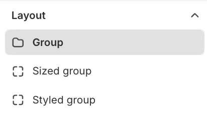
There are three types of groups available in the theme, each serving a specific purpose.
Group (Basic)
The standard Group block is the most commonly used tool for layout adjustments. It features similar layout settings to the main Section (Direction, Gap, Alignment) but applies them only to the blocks nested inside it.
Common Use Case:
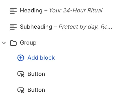
Imagine a section with a vertical layout (Heading, Text, Buttons stacked on top of each other). If you want two buttons to sit side-by-side instead of stacked, you would:
-
Add a Group block.
-
Set the Group's direction to Horizontal.
-
Place the two button blocks inside this Group.
Best Practice: Always use this basic Group unless you specifically need a background color or border. This keeps the page code lightweight and ensures optimal performance.
Styled Group
The Styled Group includes all the layout features of the Basic Group but adds rich styling options found in the Appearance settings.
Features:
-
Backgrounds: Add a solid color, gradient, image, or video background specific to this group.
-
Borders: Apply borders, control thickness, and adjust Corner radius for a card-like appearance.
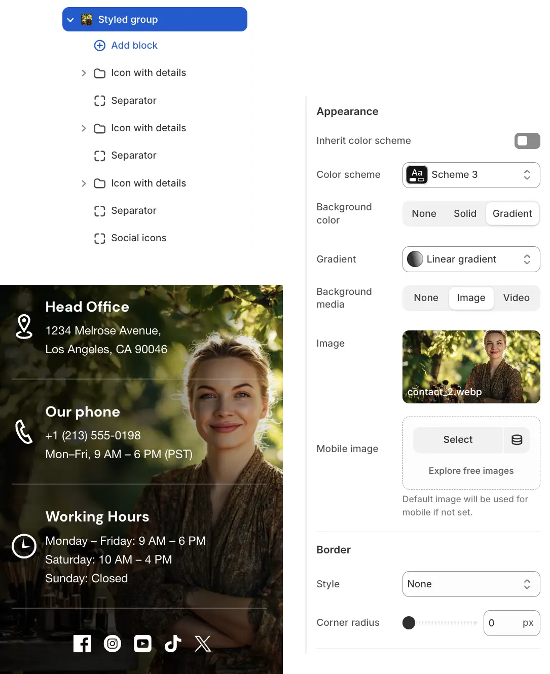
Use this when you want to create a distinct "box" or highlighted area within a section (e.g., a pricing card or a highlighted feature box).
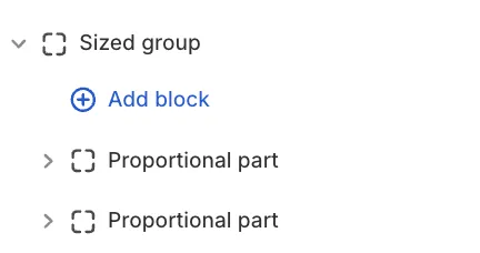
Sized Group & Proportional Parts
The Sized Group is designed for grid layouts, such as split banners or asymmetrical collages.
How it works:
Unlike other groups, the Sized Group can only contain a specific block called a Proportional part. You then place your actual content (Images, Text) inside these parts.
Desktop Layout (Horizontal)
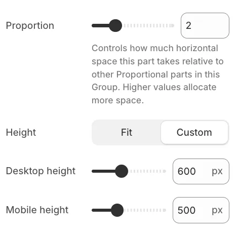
On desktops, the Proportional parts are arranged side-by-side. You control their width using the Proportion setting (1–5).
-
Logic: The theme compares the values of all parts in the group, for example:
-
If Part A is
1and Part B is1, they split the space 50/50. -
If Part A is set to
2and Part B is set to1, they split the space 2:1 (Part A takes up 2/3, Part B takes 1/3).
-
Height Control
You can control the height of each part independently using the Height setting (Fit or Custom).
-
Desktop & Mobile: While Proportion controls the width on desktop, the Height setting determines the vertical size of the block on all devices.
-
Mobile Specifics: Since the mobile layout switches to a vertical stack, the Proportion setting has no effect there. Therefore, the Height setting becomes the primary way to control the size of each block on mobile screens.