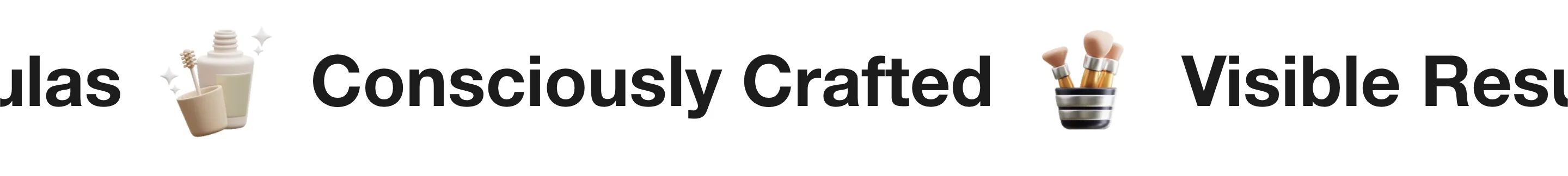
The Scrolling Content section creates a continuous, moving "ticker-tape" effect. This is excellent for announcing brand values (e.g., "Free Shipping", "Vegan", "Handmade") or displaying a stream of logos, products, and media.
Section Structure
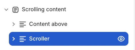
This section is designed as a unified container. This allows you to place a static heading (Content Above) directly over the moving content (Scroller) while sharing a single background image, gradient, or color for the entire area.
-
Section Settings: Controls the global background and spacing.
-
Content Above: An optional block for a static introduction or heading.
-
Scroller: The block that contains your items and controls the movement.
Scroller Configuration
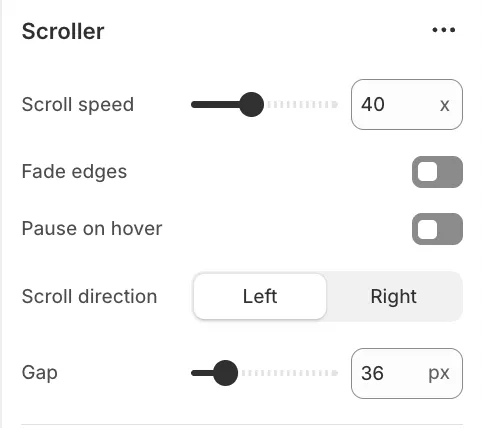
The Scroller block acts as the controller for the moving content. Click on it to adjust the following:
Movement & Effects
-
Scroll speed: Determines how fast the content moves.
-
Scroll direction: Choose Left (Forwards) or Right (Reverse).
-
Pause on hover: Stops the movement when a user hovers over the section, making it easier to click links.
-
Fade edges: Adds a soft gradient to the sides for a smooth entry/exit effect. Works best with text-only blocks.
-
Gap: The distance between blocks in pixels.
Block layout
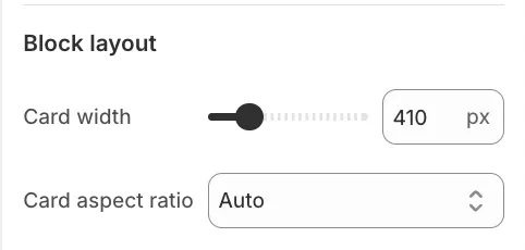
To maintain a clean, uniform look, the dimensions for all Media Cards and Collection Cards are set here, rather than on individual blocks:
-
Card Width: Sets a fixed width for all card-based blocks.
-
Aspect Ratio: Defines the shape (e.g., Square, Portrait) for images within the cards.
Content Blocks
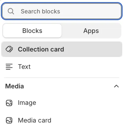
You can mix and match different content types inside the Scroller:
1. Text
Best for short announcements or brand values.
2. Image
Ideal for press logos, partner icons, or trust badges.
3. Collection Card
Displays a card linking to a specific collection.
- Dimensions: Inherited from the parent Scroller settings.
4. Media Card
A versatile card pairing an image with a heading and a link.
- Dimensions: Inherited from the parent Scroller settings.