The Freedom theme offers extensive control over the structure of your product page. You can adjust the balance between imagery and text, define scrolling behaviors, and choose specifically how your product gallery appears on different devices.
These settings are found within the Product information section in the Theme Editor.
Layout & Sizing
Page Width
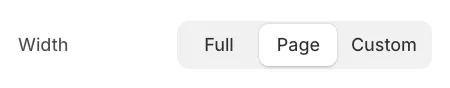
You can control the overall container width of the product details:
-
Page: Follows the global content container width.
-
Full: Spans the entire browser width.
-
Custom: Allows you to define a specific maximum width in pixels (e.g., 1400px).
Media vs. Content Ratio
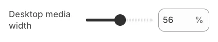
Use the Desktop media width slider to adjust the proportion of the screen occupied by your images versus your product details.
-
Range: 30% to 80%.
-
Tip: A larger media width (e.g., 65-75%) is ideal for visual-heavy brands, while a balanced 50-60% is standard for most stores.
Media Position
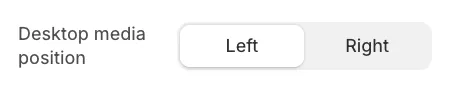
You can choose to display the product images on the Left (standard) or Right side of the screen on desktop devices.
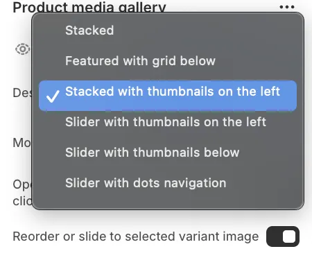
Product Media Gallery Layouts
You can configure independent layouts for desktop and mobile to ensure the best user experience on every screen. To access these options, click on the Product media gallery block inside the Product Information section.
Desktop Layouts
-
Stacked: Images appear one after another in a vertical column.
-
Featured with grid below: The main image is large, with a grid of smaller images underneath.
-
Stacked with thumbnails on the left: A vertical scrolling list of images with a sticky thumbnail strip on the side.
-
Slider with thumbnails on the left: A main slideshow with a vertical strip of thumbnails.
-
Slider with thumbnails below: A main slideshow with a horizontal strip of thumbnails.
-
Slider with dots: A clean slideshow using simple dot navigation.
Mobile Layouts
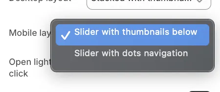
-
Slider with thumbnails: Shows a horizontal strip of small thumbnails below the main image.
-
Slider with dots navigation: Shows minimal pagination dots below the image.
Sticky Content
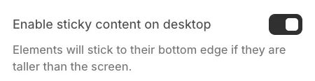
When the Enable sticky content on desktop setting is active, the product information (title, price, add to cart button) will "stick" to the screen as the user scrolls down a long list of product images.
This ensures that the "Add to Cart" button remains visible and accessible, even if you have a large number of photos in your gallery.