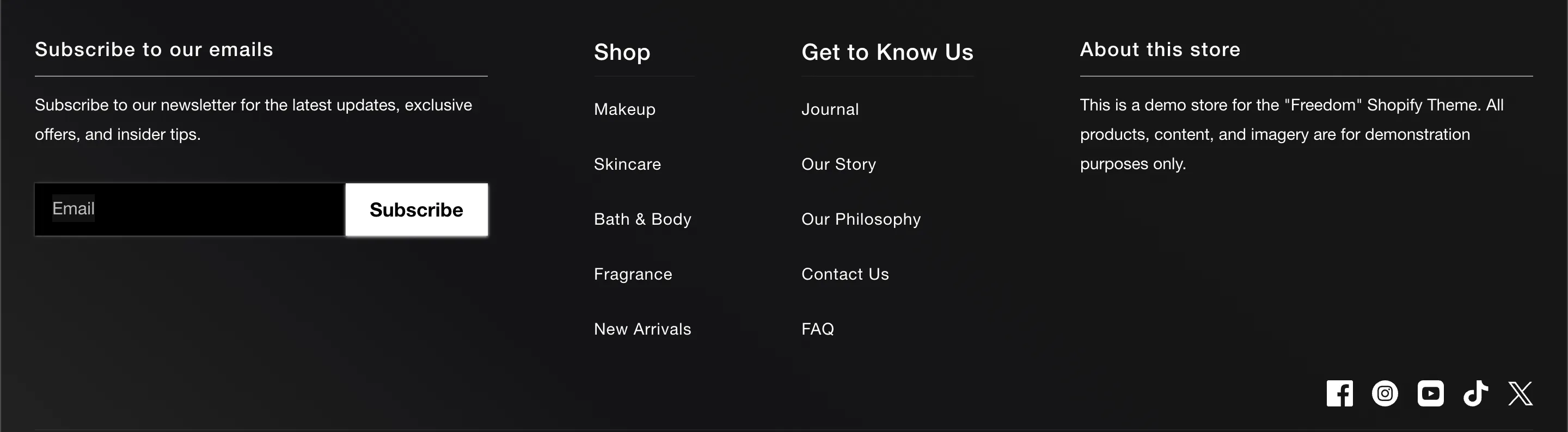
The footer is the anchor of your online store, providing essential navigation, trust signals, and legal information. Freedom splits the footer into two main areas: the content blocks (Upper) and the utility bar (Lower).
Content Blocks (Upper)
The upper section of the footer is built using standard theme blocks. You can arrange these to fit your needs:
-
Menu: Displays a vertical list of links (e.g., "Help", "Shop").
-
Text: Useful for "About Us" summaries or contact details.
-
Newsletter: A signup form for email marketing.
-
Social Icons: Displays your brand's social media links.
-
Image: Can be used for a branding logo or trust badges.
Utility Bar (Lower)
The lower section handles technical and legal requirements.
Localization
If your store sells internationally, you can enable the Country/region selector and Language selector. These dropdowns allow customers to choose their local currency and language (requires configuration in Shopify Admin Markets and Languages settings).
Policy Links
Enable Show policy links to automatically display links to your Refund Policy, Privacy Policy, Terms of Service, etc.
Note: The content for these links is pulled directly from your Shopify Admin under Settings > Policies.
Payment Icons
Enable Show payment icons to display the logos of the payment methods accepted by your store (e.g., Visa, Mastercard, PayPal). These are automatically detected based on your payment gateway settings.

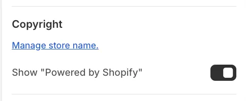
How to remove the "Powered by Shopify" label
By default, the footer displays a "Powered by Shopify" credit. To remove this:
-
Click on the Footer section in the Theme Editor.
-
Uncheck the setting labeled Show "Powered by Shopify".