The Top Bar is an area located above the main header. It is primarily used for announcements, promotions, or quick access to localization tools and social icons.
Announcement Modes
You can display announcements in two distinct ways using the Type setting:
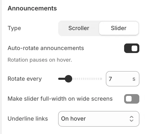
1. Slider
This mode rotates through your messages one by one using a slide or fade animation. It is ideal for longer messages that require the user's full attention.
-
Auto-rotate: Enable this to cycle through messages automatically.
-
Full width: Allows the slider to span the entire screen width on large monitors.
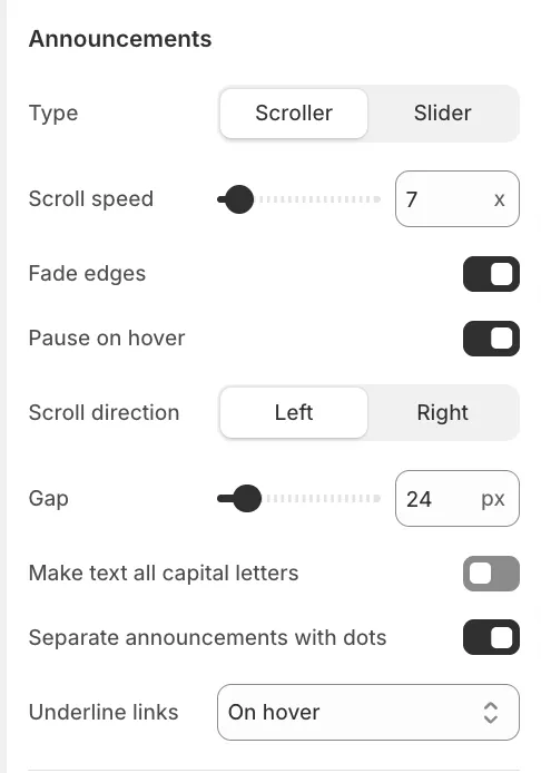
2. Scroller (Marquee)
This mode creates a continuous, moving ticker-tape effect.
-
Scroll speed: Adjust how fast the text moves.
-
Scroll direction: Choose between Left or Right movement.
-
Fade edges: Adds a soft fade effect to the sides of the bar.
-
Separate with dots: Automatically places a dot between messages.
Layout & Appearance
Overlay Colors
The Always use overlay colors setting is enabled by default. This ensures the Top Bar adopts the transparent or overlay style used by the Header, allowing it to blend seamlessly with your hero image or video banner. If you prefer the Top Bar to have a distinct, solid background, simply uncheck this setting.
Link Underlining

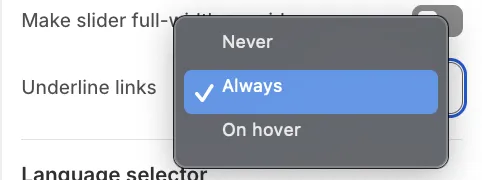
Applies to both Slider and Scroller modes. You can control the visibility of underlines for links embedded in rich text using the Underline links setting:
-
Never: Links appear without an underline.
-
Always: Links are permanently underlined.
-
Hover: Links are underlined only when the mouse hovers over them.
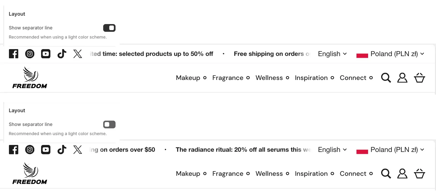
Separator Line
You can enable Show separator line to draw a thin border between the Top Bar and the Header. The separator line is typically recommended when the Top bar uses light colors.
Social Media & Localization
The Top Bar can also serve as a utility bar. When enabled, these elements are positioned on either side of the announcement text:
-
Social Media Icons: Displays icons linked to your social accounts on the left side. (Links are managed in Theme Settings > Social media).
-
Language & Country Selector: Displays dropdowns on the right side for customers to switch their region and language. Languages must be added in your Shopify Admin under Settings > Languages, and countries must be configured in your Shopify Admin under Markets.
Mobile Behavior
To save screen space on mobile devices, the Social Icons and Localization Selectors are removed from the Top Bar and displayed inside the Hamburger Menu instead. Only the announcement text remains visible at the top of the screen.