Freedom utilizes theme blocks for Mega Menus. This architecture allows you to combine your standard navigation links with rich visual content like images, videos, and promotions directly within the menu dropdown.
How it Works
When you add a Mega Menu the theme automatically generates three Static theme blocks. This structure translates the vertical list in your editor into a horizontal layout on the storefront.
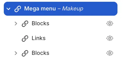
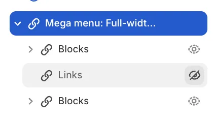
Inside the Mega Menu block you will see:
-
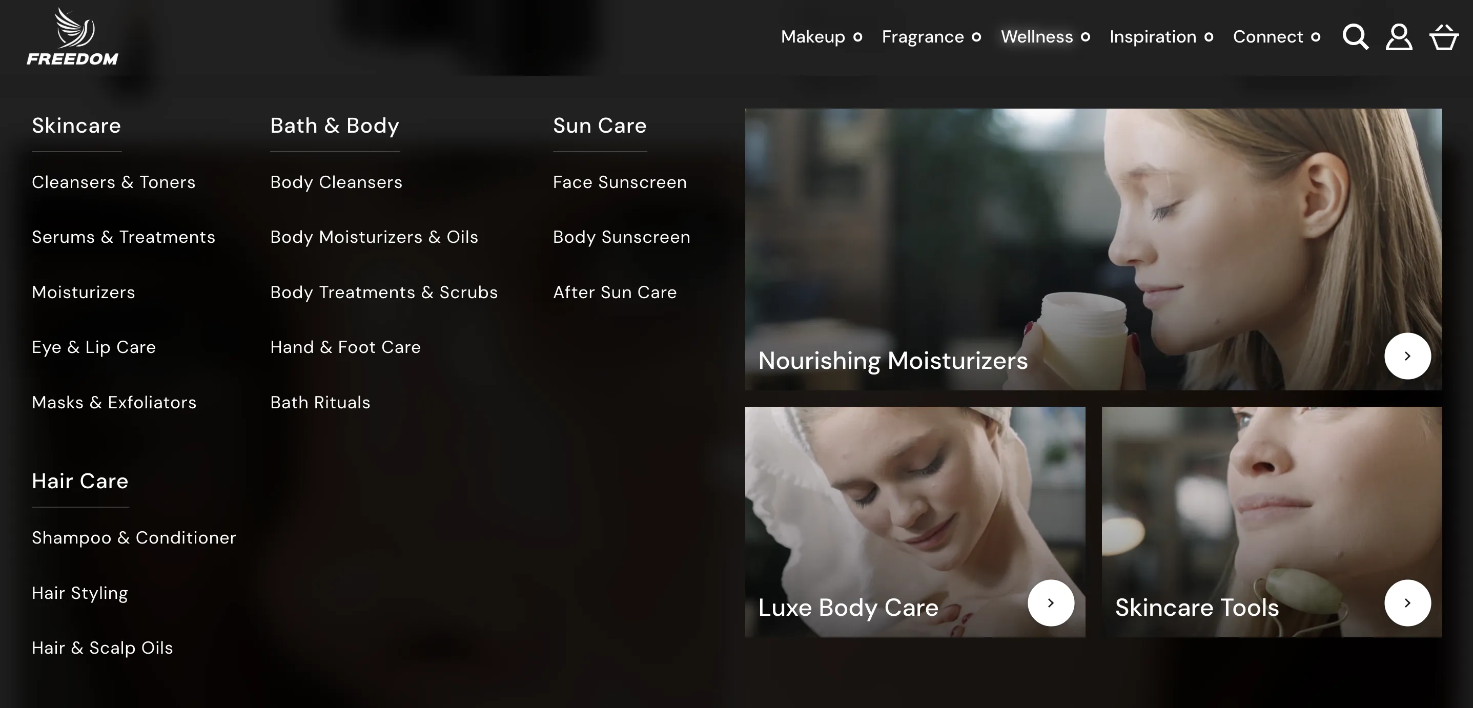
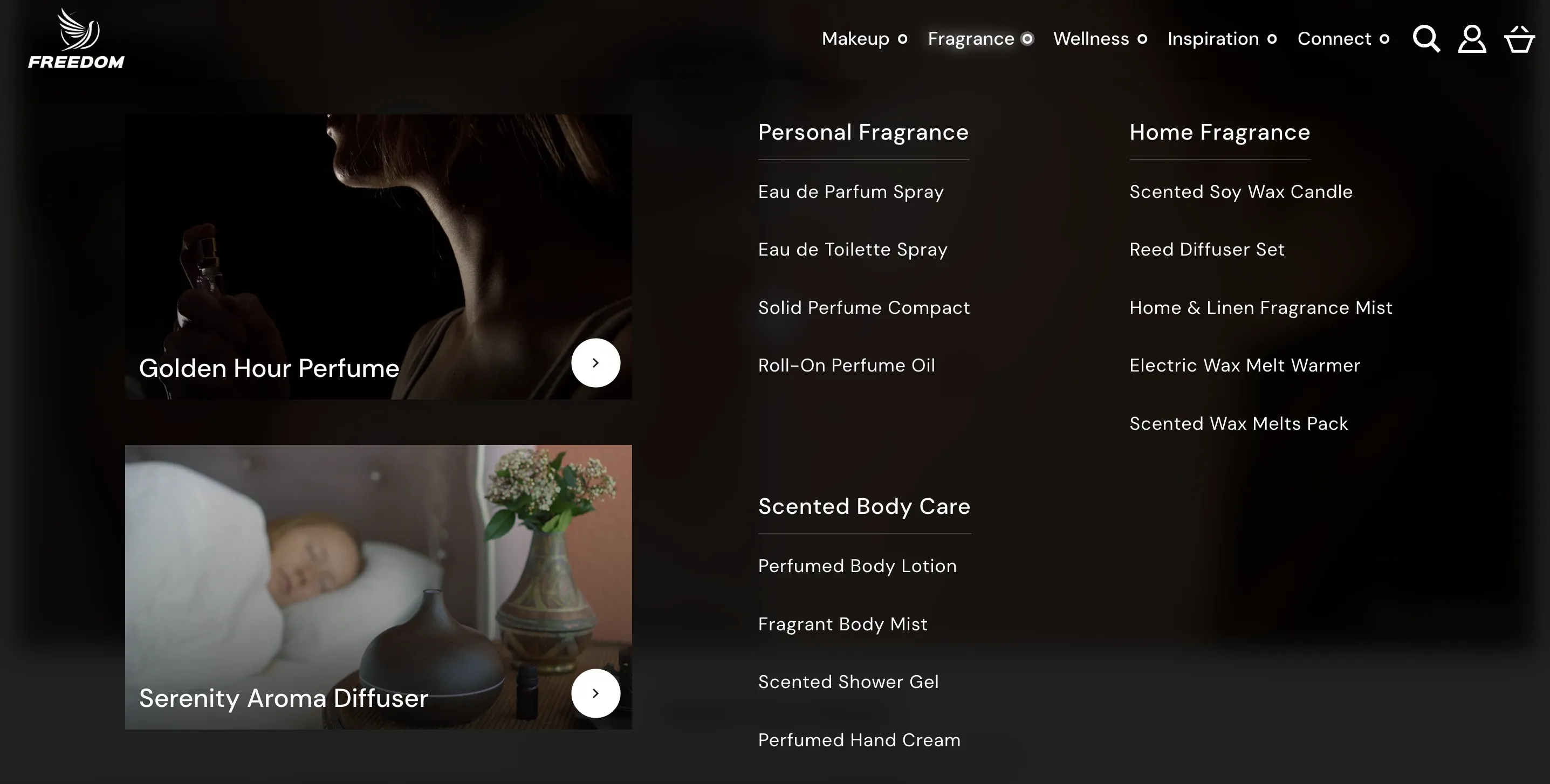
Blocks (Top Container): Any theme blocks nested inside here render to the Left of the menu links.
-
Links: The structured list of links sourced from your Menu that is set in the Header. The Menus can be created in your Shopify Admin (Content > Menus).
-
Blocks (Bottom Container): Any theme blocks nested inside here render to the Right of the menu links.
Note: Mega Menus are designed for desktop use. On mobile devices the theme automatically falls back to the standard nested navigation (hamburger menu) and ignores these visual blocks.
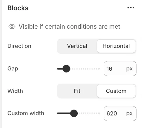
The two Blocks items act as containers for your visual content. You must configure these containers correctly to ensure your layout looks right.
-
Direction: Controls how content inside this container is arranged. Select Vertical to stack elements (like a list of promotions) or Horizontal to place them side-by-side.
-
Gap: Adjusts the empty space between the elements inside the container.
-
Width: This is the most critical setting for custom layouts.
-
Fit: The container shrinks to match the natural size of the content inside it.
-
Custom: Allows you to manually define the container width in pixels.
-
⚠️ Important:
When you are building a layout from scratch or adding new content groups we strongly recommend changing the Width setting to Custom. This unlocks the Custom width slider.
Using a custom width ensures you reserve exactly enough space for your blocks (e.g. setting it to 260px to fit a specific banner) preventing the menu links from being squashed or the layout from breaking.
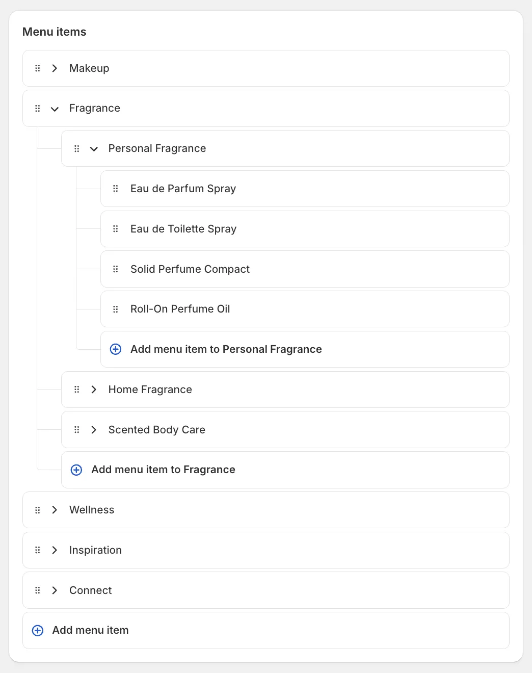
1. Creating the Menu Structure
For the best visual result we recommend using a 3-level menu structure in your Shopify Admin.
-
Level 1: The main Header link (e.g. "Shop").
-
Level 2: Column headers (e.g. "Mens", "Womens", "Accessories").
-
Level 3: The clickable links under each header.
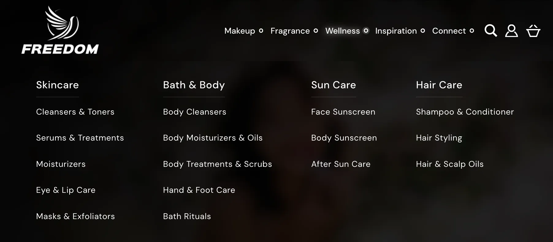
Below is an example of the menu used in our demo store:
2. Activating the Mega Menu
To turn a standard dropdown into a Mega Menu:
-
In the Theme Editor locate the Header section.
-
Under the Mega menus group click Add block and select Mega menu.
-
In the Parent menu item field type the exact name of the Level 1 link you want to attach this menu to (e.g. if your menu link is "Shop" type "Shop").
Note: The name is not case-sensitive but spelling must match exactly.
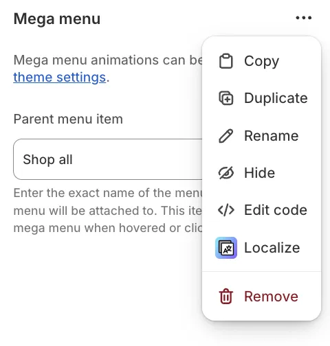
Multi-language Setup for Mega-menus
Mega menus support multi-language stores but require additional configuration. First translate your menu using Shopify's free Translate & Adapt app. Then in the Theme Editor locate your mega-menu block, click the three dots, and select "Localize".
Presets
To help you get started quickly the theme includes several presets.
Mega Menu (default)
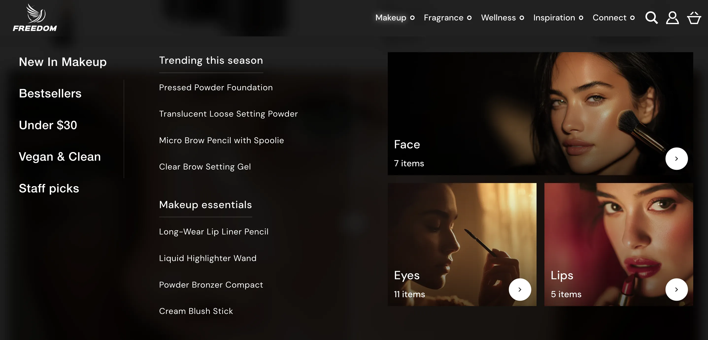
Mega menu: Card collage
Mega menu: Left-aligned cards
Mega menu: Full-width cards
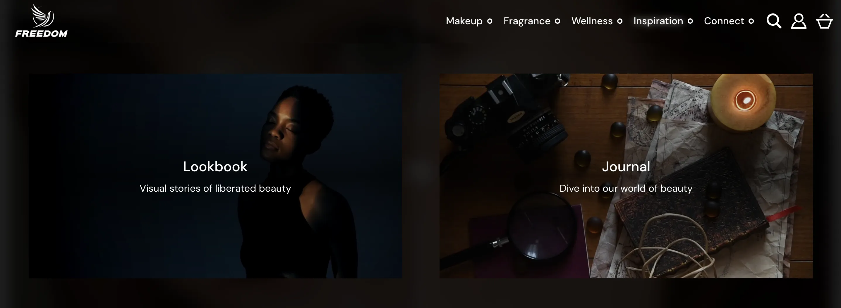
When using this preset, we recommend hiding the Links block.
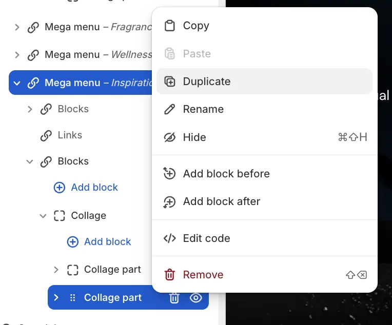
This preset uses a Collage block located in Blocks below Links. For example, to add a new card, duplicate the Collage part block.
Mega menu: Multicolumn