Layout & Design
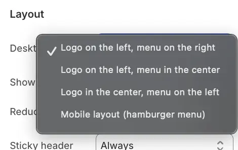
You can choose from several pre-defined layouts to best suit your brand's aesthetic. Under the Desktop layout setting, options include:
-
Logo on the left, menu on the right (Standard)
-
Logo on the left, menu in the center
-
Logo in the center, menu on the left
-
Mobile layout (Displays the "Hamburger" menu icon on desktop screens, ideal for minimalist designs)
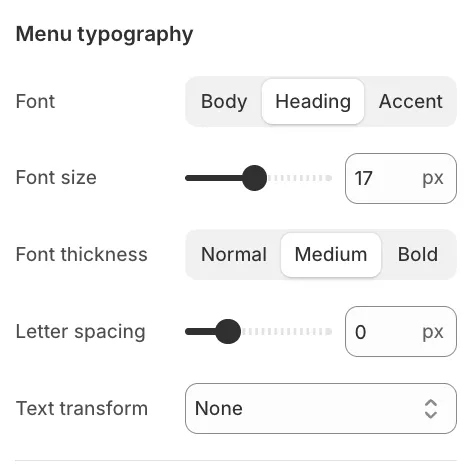
Menu Typography
To ensure your navigation links stand out, you can customize the Font family (Heading, Body, or Accent), Font size, Font weight, and Text transform (e.g., Uppercase) specifically for the header menu items.
Logo Settings
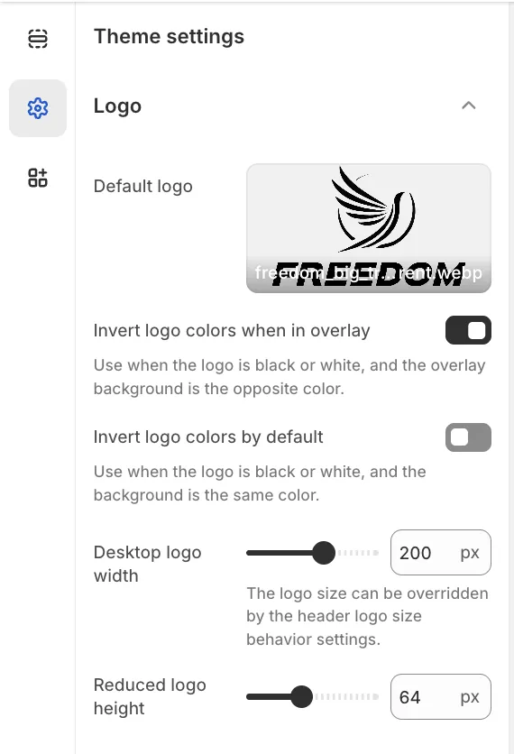
While the header controls the position of the logo, the actual image and its dimensions are managed in the global Theme Settings.
To upload your logo, navigate to Theme settings > Logo. Here you can configure:
-
Default logo: The main image used across the store.
-
Desktop logo width: Sets the base size of the logo.
-
Inverted logo: An alternative version (usually white) used specifically when the header is displayed over dark backgrounds or images to ensure visibility.
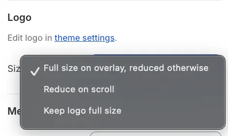
Logo Size Behavior
Back in the Header section settings, you can control how the logo behaves when the user scrolls down the page:
-
Full size on overlay, reduced otherwise: The logo appears at its maximum size when on a transparent overlay (like the homepage banner) but shrinks to a compact size on other pages or when scrolling.
-
Reduce on scroll: The logo actively shrinks to the Reduced logo height (defined in Theme Settings) as the user scrolls down to save screen space.
-
Keep logo full size: The logo maintains its dimensions regardless of scroll position.
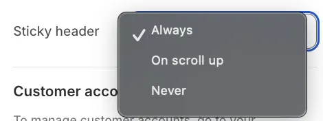
Sticky Header Behavior
The Sticky header setting determines how the navigation bar behaves as customers browse your store:
-
Always: The header remains fixed at the top of the screen and is always visible.
-
On scroll up: The header disappears when scrolling down to maximize viewing area but reappears immediately when the user scrolls up.
-
Never: The header remains at the top of the page and moves out of view when scrolling.
Color & Overlay Logic
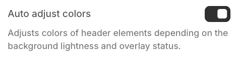
Auto Adjust Colors
When enabled, the theme detects the brightness of the background behind the header. If the header is placed over a dark background or image, the text and icons will automatically switch to a light color (and vice-versa).
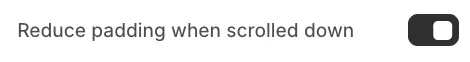
Reduce Padding on Scroll
Enable this setting to visually "tighten" the header when the user scrolls down. This reduces the vertical space the header occupies, allowing more room for current page content.