The Freedom theme uses an extended color scheme configuration that defines two color layers within each scheme. In addition to standard Background and Text colors, every color scheme also includes dedicated Overlay Background and Overlay Text colors.
Overlay colors are applied automatically whenever a section or block uses an image, video, gradient, or solid color as its background. This ensures consistent text readability without requiring manual changes to the assigned color scheme.
Understanding Color Schemes
Each color scheme (for example, Scheme 1 or Scheme 2) includes two sets of color definitions that work together automatically depending on the background type:
-
Standard colors
Used when a section or block displays content on a regular background without overlay behavior. -
Overlay colors
Applied automatically when content is displayed over an overlay background, such as images, videos, gradients, or solid overlay backgrounds.
Default configuration
By default, the first two color schemes share the same Standard (General) colors but differ in their Overlay colors. This provides ready-to-use contrast options for different overlay scenarios:
-
Scheme 1: Optimized for dark overlays (for example, light text on a dark overlay background).
-
Scheme 2: Optimized for light overlays (for example, dark text on a light overlay background).
Configuring a Color Scheme
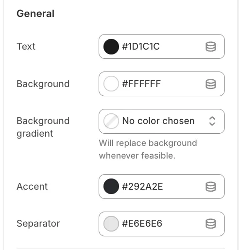
1. General
These settings define the appearance of content when no overlay behavior is active.
-
Text: Primary color for headings and body text.
-
Background: Solid background color for sections.
-
Background gradient: If set, this overrides the solid background color.
-
Accent: Used for links and highlighted elements.
-
Separator: Used for borders and dividing lines.
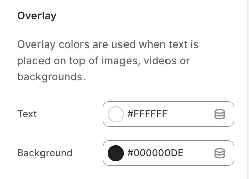
2. Overlay
These settings are applied automatically when overlay behavior is active.
-
Overlay Text: Text color used when content appears over an overlay background.
-
Overlay Background: A semi-transparent color (for example, black with 40% opacity) used to improve text contrast over images or other backgrounds.
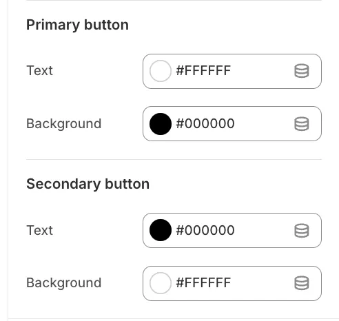
3. Buttons
Each color scheme defines styles for Primary and Secondary buttons.
-
Background: Button fill color.
-
Text: Button label color.
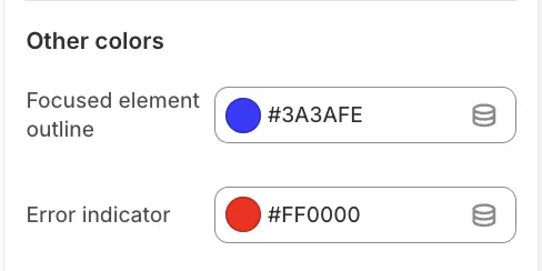
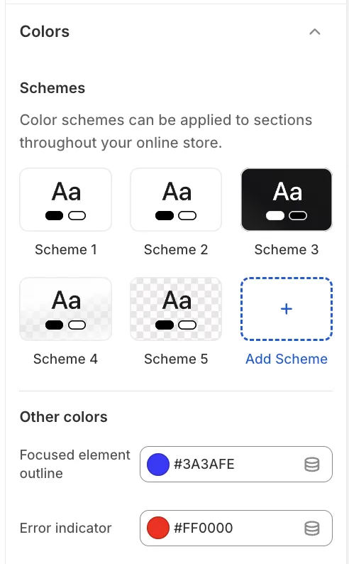
Global Colors
Global colors apply across all color schemes.
-
Focused element outline: The outline color shown when navigating via keyboard (accessibility).
-
Error indicator: The color used for form validation and error messages.